Preview image. Unlock full-res
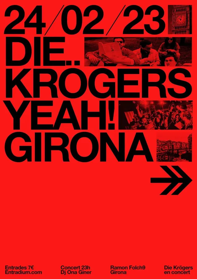
Brutalist concert poster with dominant black sans-serif display type on bright red, punctuated by fragmented monochrome crowd photography and event logistics.
Summary
A visceral concert poster using raw sans-serif typography, bright red ground, and monochrome crowd photos in a Swiss-inspired brutalist layout.
Visual description
Bright red background fills the entire canvas. Large black condensed sans-serif headline "24 / 02 / 23 DIE. KROGERS YEAH! GIRONA" dominates the upper two-thirds, set in all-caps with slashes separating the date and staggered line breaks. Three rectangular monochrome photographs of concert scenes (audience, venue, performers) are embedded into the red field as cropped insertions breaking the text rhythm. Small print at bottom reads event details: venue, time, DJ name, location. A double-arrow icon in black sits lower right. The effect is urgent, unpolished, and deliberately confrontational.
Key takeaway
The single-color (red) plus black duotone strips all decoration, forcing the typography to perform all the heavy lifting. Fragmented photography creates visual texture without color complexity. Staggered line breaks and punctuation marks (slashes, periods) add personality and pace that a locked grid would lose. The condensed sans-serif set tight carries punk attitude.
Reuse notes
Excellent for music, cultural events, or any project needing to signal rawness and counterculture. The red-black palette is high-impact for small posters (prints), less ideal for screens where the brightness can glare. The brutalist, no-nonsense approach works best when the event itself is the star, not the design.
More like this

Keep what you find
A free account saves references to boards and can send you a weekly email of picks based on what you save.
To see every result, go Pro.