Preview image. Unlock full-res
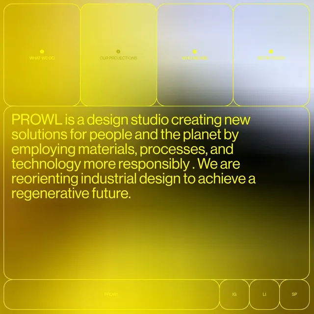
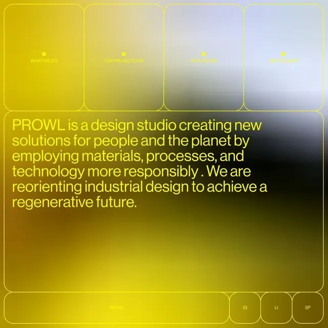
Navigation interface with four vertical cards using gradient fills that transition from warm yellow-gold to cool gray and lavender, each labeled with a section topic.
Summary
Navigation interface with four tall rounded cards, each filled with a linear gradient that shifts from warm gold/yellow on the left to cool gray/lavender on the right, anchoring a large brand statement below.
Visual description
Four narrow vertical cards with rounded corners and thin white borders, arranged in a row. Card 1 (left): solid gold gradient, white label "WHAT WE DO" centered. Cards 2-4: gradients progressively shift rightward to cool gray (card 2), then to light lavender (cards 3-4). Each has a small white dot icon and label: "OUR PROJECTIONS", "WHY WE ARE", "WHAT WE WANT". Below spans a large full-width dark panel with yellow sans-serif body text: "PROWL is a design studio creating new solutions for people and the planet by employing materials, processes, and technology more responsibly. We are reorienting industrial design to achieve a regenerative future." Footer: "PROWL" on dark, plus small light-colored social icons.
Key takeaway
The gradient-card navigation system: each card's gradient entrance tells a color story (warm to cool) without abrupt color shifts. The combination of gradient fills with minimal white borders creates depth while remaining clean. Placing the brand narrative below as a unified text block, rather than fragmenting it, maintains coherence on a card-based layout.
Reuse notes
Strong for design studios, creative agencies, or sustainability-focused brands. The warm-to-cool gradient sequence works well when you have 3-4 sections to navigate. Works best on light or white backgrounds. Reduce card height if screen real estate is limited; gradient effect remains legible even at smaller scales. The "regenerative" / sustainable mission pairs naturally with this gradient-forward, nature-informed color story.
More like this






Keep what you find
A free account saves references to boards and can send you a weekly email of picks based on what you save.
To see every result, go Pro.