Preview image. Unlock full-res
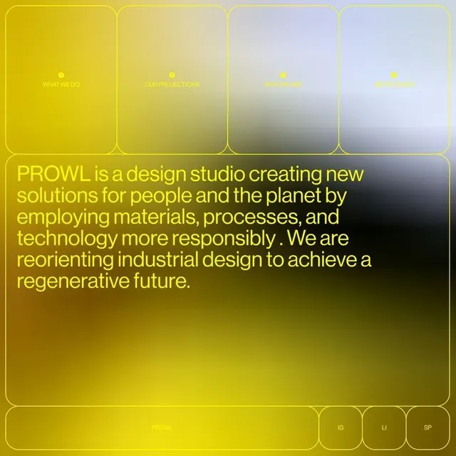
A golden-to-gray gradient system with rounded-corner modular panels, light copy about regenerative industrial design, and navigation buttons, establishing a cohesive brand identity.
Summary
A golden-to-gray gradient system with rounded-corner modular panels, light copy about regenerative industrial design, and navigation buttons, establishing a cohesive brand identity.
Visual description
The design uses a unified color system built on smooth gradients transitioning from golden yellow through olive greens and purples to cool grays. Four rounded-corner header tiles stack horizontally, each labeled "WHAT WE DO", "FURTHER ACTIONS", "GET IN...", and an unlabeled fourth. Each tile contains a subtle gradient from the same palette. Below is a large rounded rectangle panel in dark golden-olive containing a manifesto paragraph in light yellow type about PROWL's mission to employ materials and processes responsibly and reorient industrial design toward regenerative outcomes. At the bottom, a row of small rounded buttons contains text labels: "LOCAL", "KG", "LI", "SP". The composition feels soft and aspirational despite covering serious environmental topics. Consistent border radius and padding creates a clean, modern grid without harsh edges.
Key takeaway
The gradient system unifies disparate elements into a single visual language. Using soft, rounded corners throughout prevents cold minimalism. Golden-yellow text on dark olive ground reads as warm and inviting rather than corporate. The modular tile structure allows for flexible content blocks while maintaining visual cohesion.
Reuse notes
Ideal for design studios, consulting agencies, or tech companies wanting a sophisticated yet approachable brand. The gradient-to-solid color approach works at any scale and translates well to web. Best suited for brands with environmental or social missions, where the warm palette suggests care and thoughtfulness. Avoid using on screens smaller than tablet size where the subtle gradients may compress.
More like this



Keep what you find
A free account saves references to boards and can send you a weekly email of picks based on what you save.
To see every result, go Pro.