Preview image. Unlock full-res
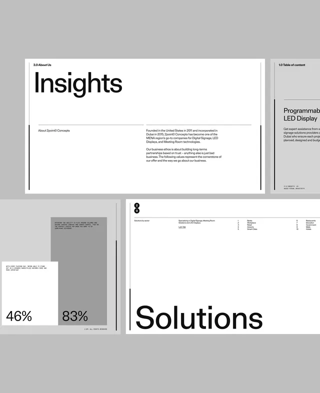
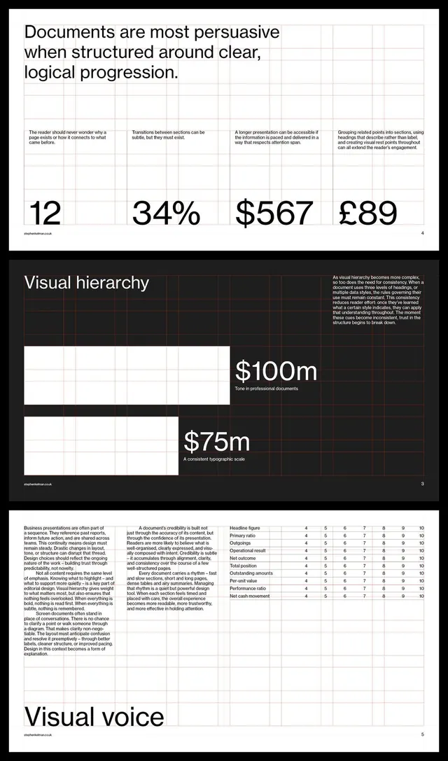
Corporate presentation layout stacking sections with heavy type, high contrast, and statistical callouts in strict black, white, and gray.
Summary
Corporate presentation deck spanning multiple pages, leading with "Insights" and "Solutions" in massive sans-serif type over a palette of black, white, gray, and light gray fields.
Visual description
Four nested pages form a strict black-and-white presentation system. Top page shows navigation: "3.0 About Us" heading (left margin, small) with "Insights" as the main headline, followed by two-column body text about "Solstich Concepts" and business philosophy. Right column lists "Table of contents" with section headers. Center-left page displays a large gray field with small text (barely legible at this scale) and "46%" and "83%" callouts in oversized digits, paired with section index. Bottom right: an all-caps "Solutions" headline dominates, anchored by fine sans-serif explanatory text. Every spread employs heavy type hierarchy, generous margins, and white space to separate dense information into scannable blocks. The palette remains absolute: black text, white paper, gray fields for emphasis or separation. Page numbers appear in corners. No color, imagery, or ornamentation.
Key takeaway
Scaling typography aggressively (percentages and section headers become graphic elements) adds movement without color. Monochrome forces hierarchy onto type weight, size, and spacing alone. Structured grid with ample margin breathing room makes information feel authoritative rather than cramped. The approach scales statistics and data points into visual anchors.
Reuse notes
Ideal template for fintech, consulting, or analytics presentations where data credibility matters more than polish. The high-contrast monochrome works exceptionally well for PDFs and print. Pairs well with content about market research, financial analysis, or business strategy. Avoid if your brand needs color personality or emotional warmth.
More like this


Keep what you find
A free account saves references to boards and can send you a weekly email of picks based on what you save.
To see every result, go Pro.