Preview image. Unlock full-res
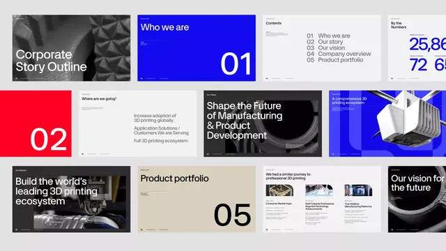
A multi-slide corporate presentation on 3D printing manufacturing alternating between bold electric-blue section openers (large drop numbers) and neutral beige content pages (text, charts, imagery).
Summary
A 12-slide pitch deck on additive manufacturing using bold electric-blue section dividers (numbered 01-05) paired with reserved beige and white content spreads containing mission statements, imagery, and business narratives.
Visual description
A grid of 12 slide thumbnails showing a consistent design system. Keynote spreads use a full-bleed electric-blue background with oversized white numbers (01, 02, 05) and stacked white sans-serif copy: "Who we are", "Where are we going?", "Shape the Future of Manufacturing & Product Development". Content spreads alternate between beige, white, and charcoal backgrounds with left-aligned black or grey body text, black-and-white photography of manufacturing processes, and occasional white accent elements. Typography throughout is sans-serif, ranging from display-weight for opener headlines to text-weight for body content. A small logo lockup anchors lower right on each slide. The color palette is disciplined: electric blue + white for emphasis, beige + charcoal + white for content, light grey for secondary text.
Key takeaway
Large, stylized drop numbers (01, 02, 05) on saturated blue create immediate visual breaks and anticipation without chapter headings. Alternating high-contrast blue with reserved beige/white content pages creates breathing room and emphasizes the sectional narrative. The consistent slide margins, logo placement, and typography hierarchy reinforce authority. Photography of products/processes sits cleanly on neutral backgrounds, competing minimally with type.
Reuse notes
Effective for manufacturing, hardware, or technical B2B pitches where you need to convey both vision (blue openers) and substance (content pages). The blue feels contemporary without veering into trendy gradients. The system scales to 8-15 slides without visual fatigue. Works equally well printed or on screen. Best avoided for consumer or entertainment pitches where softer emotion or playfulness is required.
More like this


Keep what you find
A free account saves references to boards and can send you a weekly email of picks based on what you save.
To see every result, go Pro.