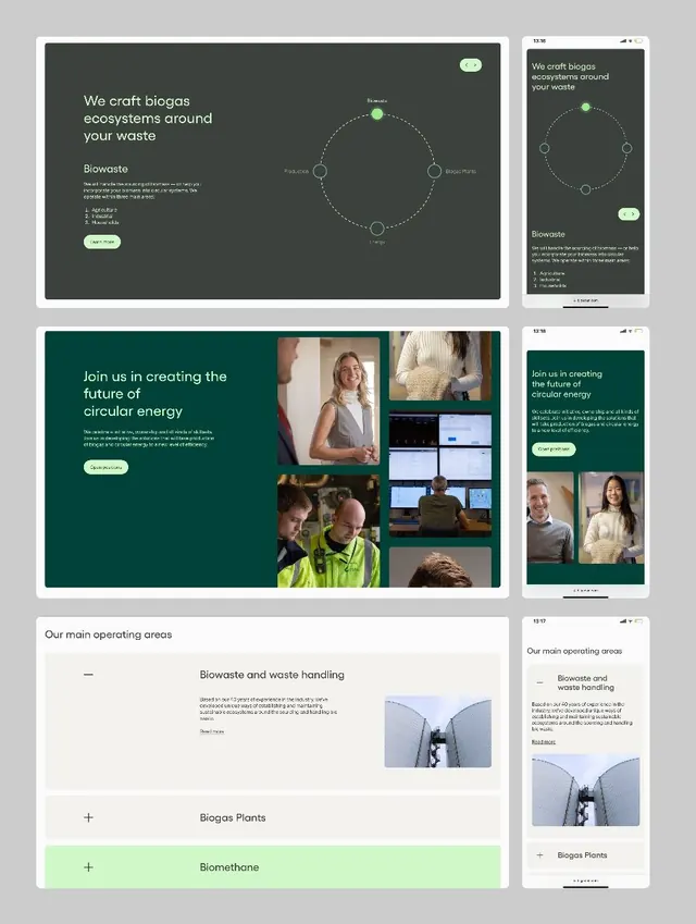
Preview image. Unlock full-res
Dark-mode product interface for a biotech waste-management startup, spanning desktop and mobile with circular systems diagrams, photo grids, and collapsible sections.
Summary
Dark-mode SaaS interface for a biotech circular-energy startup, showing systems diagrams, team photos, and data dashboards on desktop and mobile viewports.
Visual description
Three tiers of desktop and mobile mockups. Top row: main dashboard with "We craft biogas ecosystems around your waste" headline on dark teal, accompanied by a circular node-and-edge diagram (white lines, green accent dots, light node labels) showing interconnected process flows. Middle row: dark teal section with "Join us in creating the future of circular energy" and a photo mosaic of team members and facility scenes, plus a smaller panel of operations dashboards and team portraits on mobile. Bottom row: white/light-gray section with accordion-style expandable menus for "Biowaste and waste handling," "Biogas Plants," and "Biomethane," each with a subheading and supporting photograph. Sans-serif type throughout in various weights for hierarchy.
Key takeaway
The circular systems diagram communicates a complex process without overwhelming the viewer; green accent dots guide the eye. Dark-mode backgrounds reduce cognitive load for data-heavy content. The mixed layout of photo grids, diagrams, and accordion menus shows how to organize heterogeneous content (team, data, operational) in one coherent interface.
Reuse notes
Strong for deep-tech or climate-tech B2B products where trust and clarity matter. The dark palette works well for data-dense dashboards and infrastructure software. The combination of diagrams plus human photography conveys both technical competence and team culture. Mobile parity is shown side-by-side, useful for pitch decks or design documentation.
More like this




Keep what you find
A free account saves references to boards and can send you a weekly email of picks based on what you save.
To see every result, go Pro.