Preview image. Unlock full-res
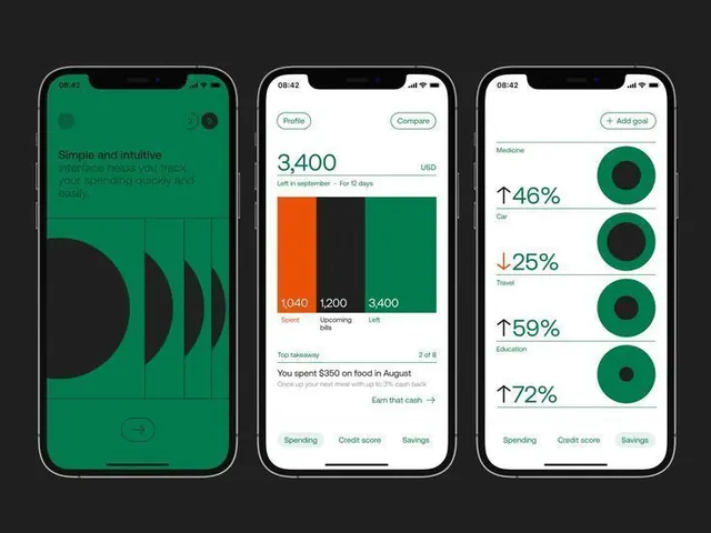
Three-phone fintech mockup showing a data-driven dashboard with emerald green accents, stacked bar charts, and circular percentage indicators for spending categories.
Summary
Three iPhone mockups display a fintech spending tracker with emerald-green accent color, horizontal bar charts for category spending, and circular progress indicators for metrics.
Visual description
Three iPhones arranged horizontally against a charcoal background. The left phone features large, flowing teal circles as visual rhythm on a solid emerald background, with caption text in a lighter green. The center screen shows a spending dashboard with a stacked bar chart (orange, dark, teal sections labeled "Today," "Pending," "Later") and transaction details. The right screen displays four circular indicators (dark blue backgrounds, teal progress rings) each showing a percentage change (up/down arrows) for spending categories (Medicine, Commute, Travel, Education), with category icons and tabbed navigation below. All screens use a tight sans-serif, consistent 16px grid spacing, and balanced whitespace within card containers. System status bar (time, signal, battery) visible at top of each phone.
Key takeaway
The emerald-green-on-dark color strategy creates sharp visual hierarchy without harshness. The circular percentage indicators with directional arrows offer an intuitive way to compare multi-category metrics at a glance. Three full-screen mockups side-by-side show state variations (onboarding, transactional, analytical) in a single tight composition.
Reuse notes
Excellent reference for fintech app dashboards, spending-tracker UIs, and multi-screen product presentations. The emerald + charcoal palette works well for trustworthy financial apps. Works best when you have real data to visualize; adapt the chart type to your use case.
More like this

Keep what you find
A free account saves references to boards and can send you a weekly email of picks based on what you save.
To see every result, go Pro.