Preview image. Unlock full-res
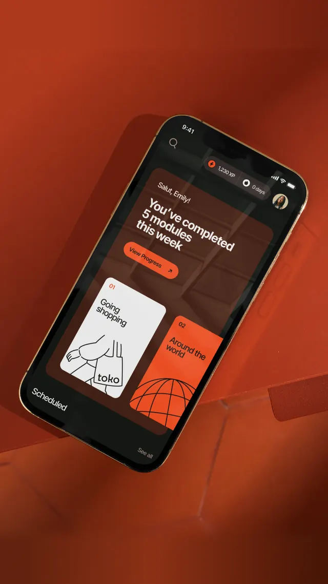
Mobile interface mockup in dark brown and black with warm terracotta orange accents, featuring stacked card layout with icon, text, and button hierarchy.
Summary
Mobile interface mockup in dark brown and black with warm terracotta orange accents, featuring stacked card layout with icon, text, and button hierarchy.
Visual description
A portrait-oriented phone screen against a red-orange background. The screen interior is filled with a dark brown-black gradient. At the top is a header bar with icon and settings toggle. Below sits a notification banner in terracotta orange containing headline text. The main content area shows two stacked card modules: the left card displays a white line-drawn icon on a light background; the right card shows a globe icon and descriptive copy in white and light gray text. An orange button labeled with call-to-action text anchors the bottom of the visible area. Type hierarchy is clear, with label text in smaller light gray and primary buttons in solid warm orange against the dark ground.
Key takeaway
The warm orange accent acting as a UI highlight and focal point in an otherwise cool dark interface, creating warmth without chromatic disturbance. The clear card-and-button rhythm making information scannable. The soft-contrast reading hierarchy (small label text in light gray, large primary text in white, action orange in maximum contrast).
Reuse notes
Strong pattern for education, wellness, and productivity apps targeting focused, distraction-free experiences. The warm earth tones offset dark-mode fatigue and read as approachable and calming. Works best for content-forward designs where the app itself should feel like a tool, not a distraction.
More like this

Keep what you find
A free account saves references to boards and can send you a weekly email of picks based on what you save.
To see every result, go Pro.