Preview image. Unlock full-res
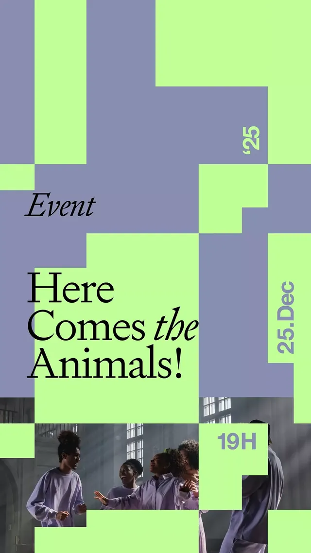
Event poster built from stacked, overlapping rectangular shapes in lime green and muted purple, anchored by large black serif type and a lifestyle image.
Summary
Event poster built from stacked, overlapping rectangular shapes in lime green and muted purple, anchored by large black serif type and a lifestyle image.
Visual description
A dynamic asymmetric grid of rectangular blocks in alternating muted purple and neon lime green covers the full canvas. Overlapping geometry creates depth without perspective. Large black serif headlines ("Here Comes the Animals!") occupy the left-center, with supporting text in muted purple (event label "Event" in italic script upper-left, date badges "25.Dec" and "19H" in bright cyan serif on purple grounds, right margin). A color photograph of four people in casual clothing fills a rectangular cutout at the bottom-center, partially cropped. The interplay of geometric abstraction and real photography creates visual tension, while the high-contrast lime and purple palette reads immediately even at small scale.
Key takeaway
The blocking strategy: large overlapping rectangles create rhythm and guide the eye without symmetry. Color opposition (bright lime against muted purple) ensures legibility and energy. Mixing geometric abstraction with photography anchors the poster to real human context while keeping the design bold and graphic.
Reuse notes
Strong for event promotions, festival posters, and youth-facing campaigns where energy and asymmetry matter more than balance. The neon/muted combination works well on print or digital. Pair this with similarly bold typography for consistency; avoid soft color palettes.
More like this




Keep what you find
A free account saves references to boards and can send you a weekly email of picks based on what you save.
To see every result, go Pro.