Preview image. Unlock full-res
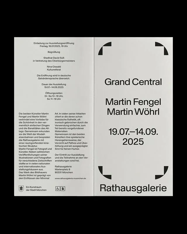
A split-layout exhibition poster using strict typographic hierarchy and hand-drawn corner flourishes to balance formal documentation with creative visual punctuation.
Summary
A split-layout exhibition poster using strict typographic hierarchy and hand-drawn corner flourishes to balance formal documentation with creative visual punctuation.
Visual description
Left half is dense text blocks set in a single sans-serif column with tight leading, documenting exhibition details, artist biographies, and institutional information. Right half presents a clean, centered layout with large title text (Grand Central, artist names Martin Fengel and Martin Wöhrl, dates 19.07-14.09.2025), separated by thick negative space. Corner ornaments appear in all four corners as hand-drawn curved marks, adding a touch of personality to the strict grid. Beige and off-white background with black type, grays for secondary information. Layout strictly observes a vertical split with margins creating white breathing room around the right panel.
Key takeaway
The combination of institutional rigor (dense left column with legal information) and visual breathing room (sparse right side). Corner ornaments as a way to soften geometric grids without compromising modernist discipline. Using typeface size and weight as sole hierarchy device without color shifts.
Reuse notes
Effective for exhibition or event posters where dual information needs must coexist. The corner devices work especially well on printed collateral where precision and hand-crafted warmth are both desired. Scale the left-column density for your audience's patience with reading; this poster trusts viewers to engage with text.
More like this




Keep what you find
A free account saves references to boards and can send you a weekly email of picks based on what you save.
To see every result, go Pro.