Preview image. Unlock full-res
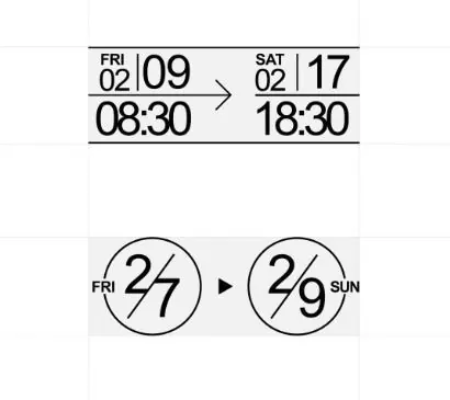
Minimalist date and time indicator using stark black lines, bold typography, and circular dial elements on white background.
Summary
A date-time range selector showing a horizontal sequence from Friday 02/09 08:30 to Saturday 02/17 18:30, with an alternative circular dial representation below.
Visual description
Minimal, high-contrast design on white background. Top section: a left-to-right sequence of four text fields in black sans-serif (FRI 02, 09, 08:30, and right side SAT 02, 17, 18:30) separated by thin black horizontal rules and connected by a right-pointing arrow. Below: two circular dial elements (one showing "FRI 27", one showing "29 SUN") connected by a right-pointing arrow and a small play icon, suggesting a range or progression. All type is bold, mono-weight sans-serif; spacing is generous and rhythmic, creating a modular, grid-like effect despite the minimal line work.
Key takeaway
The use of stark geometric division (horizontal lines, circles) to organize date and time data without decorative color; the rhythm created by repeating similar elements with clear directional indicators; the combination of linear and circular representations for the same concept, suggesting alternative UI patterns.
Reuse notes
Effective for scheduling interfaces, date-range pickers, or timeline graphics where clarity and minimal visual noise are priorities. The stark monochrome approach works across contexts from app design to print. Avoid if you need soft, warm, or organic visual language; this aesthetic is intentionally austere.
More like this






Keep what you find
A free account saves references to boards and can send you a weekly email of picks based on what you save.
To see every result, go Pro.