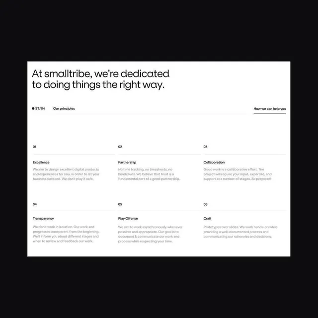
Preview image. Unlock full-res
Corporate principles layout using oversized sans-serif headlines, numbered in bold, set on a white panel against deep black background, with muted gray subtext.
Summary
A corporate design system documenting six numbered principles on a white panel, using oversized sans-serif display type, tabbed navigation, and monochrome hierarchy to emphasize clarity.
Visual description
White rectangular panel centered against a deep black background. Top features an oversized sans-serif headline in black: "At smalltribe, we're dedicated to doing things the right way." Below, a horizontal navigation bar displays "ST/04 | Our principles" on the left and "How we can help you" (underlined) on the right, separated by a thin rule. Content area is divided into two rows of three columns. Each column opens with a bold two-digit number (01, 02, 03, 04, 05, 06), followed by a five to six-word principle name in display sans-serif (Excellence, Partnership, Collaboration, Transparency, Play Offense, Craft). Under each principle sits four lines of muted gray body copy (nine to eleven words per line) describing the principle. Vertical and horizontal rules create a grid structure. All type is sans-serif, fully left-aligned, and rendered in pure black, white, and one gray tone.
Key takeaway
The numbered list structure scaled typographically (numbers drawn large, bold, and scannable). The tabbed navigation pattern signaling multiple sections without visual clutter. The white-on-black isolation making dense text readable. Pairing overscaled headlines with restrained gray body text to control visual hierarchy.
Reuse notes
Fits consulting, agency, and B2B services that need to communicate multiple principles or values clearly. The monochrome approach works at any scale and prints crisply. The grid system is flexible for three, four, or six items. Avoid using on busy backgrounds; the panel isolation is key to readability.
More like this



Keep what you find
A free account saves references to boards and can send you a weekly email of picks based on what you save.
To see every result, go Pro.