Preview image. Unlock full-res
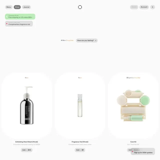
Minimalist ecommerce layout featuring white-background product photography in a structured grid, with green and gray callout banners for promotions and alerts.
Summary
Ecommerce product page layout using a three-column grid of high-key product shots, with soft green and gray promotion banners anchoring callouts for shipping, offers, and upsells.
Visual description
Top section: light gray header navigation (Menu, Shop, Journal tabs) with a centered brand mark and right-aligned account/search buttons. Two prominent callout banners below—one green with white text promoting free US shipping; one gray with a pink accent for a complimentary gift. Center stage: a white-background three-product grid featuring close-up photography of cosmetics (black bottle, glass vial, pastel multi-sphere care kit) each with a single-line description and price button. Text hierarchy is gentle; typography is small, sans-serif, and restrained. Footer text labels (New, 3D printed to order) are in a muted warm orange. Ample white space surrounds each product.
Key takeaway
The two-tier callout system (green for benefit, gray for secondary offers) draws the eye to conversion points without visual aggression. Product photography is perfectly lit for clarity and appeal. The three-column grid balances density and breathing room, and the color palette (off-white, warm brown, pale green, silver) is sophisticated without overshadowing the products.
Reuse notes
Ideal for cosmetics, skincare, or luxury wellness ecommerce sites where product quality and purity matter. The minimal, high-key approach positions products as premium. The promotion banners convert without clutter. Avoid overcrowding the grid or adding too many callout colors, which would dilute the elegance.
More like this
Keep what you find
A free account saves references to boards and can send you a weekly email of picks based on what you save.
To see every result, go Pro.