Preview image. Unlock full-res
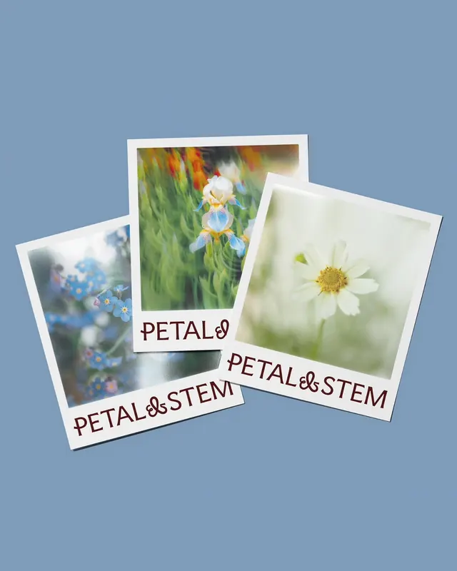
Three stacked polaroid-format stationery cards featuring soft botanical photography of blue forget-me-nots, iris, and white daisy flowers, each printed with the brand name in earthy serif type.
Summary
A minimal stationery set presented as three overlapping polaroid cards, each featuring a different soft-focus botanical photograph paired with earthy serif typography that anchors the brand identity.
Visual description
Three white-bordered cards arranged in a cascading overlap against a dusty blue background. Each card holds a close-up photograph of a different delicate flower: blue forget-me-nots with orange stamens (left), a purple and white iris in green foliage (center), and a white daisy with yellow center on soft green (right). Below each photo, the brand name "PETAL & STEM" is printed in a warm-toned serif typeface with slightly condensed letterforms. The overall palette is muted and earthy: soft blue-gray, moss green, pale cream, and warm taupe. The softness of the botanical photography contrasts with the clean, readable type, creating a balance between romantic and structured.
Key takeaway
The pairing of diffused, organic subject matter with a traditional serif typeface creates immediate brand personality. Using polaroid format and overlapping composition suggests craft, handmade care, and a curated collection. The restrained color palette makes the photography the hero while the type provides visual weight and stability.
Reuse notes
Excellent template for botanical, wellness, plant-based, or craft-focused brands. Works especially well for stationery, packaging, and direct-mail applications where a handcrafted feel is desirable. The soft photography style and muted palette suit slower-paced, premium brand voices. Avoid on high-energy or minimalist-tech brands where the organicism would feel out of place.
More like this




Keep what you find
A free account saves references to boards and can send you a weekly email of picks based on what you save.
To see every result, go Pro.