Preview image. Unlock full-res
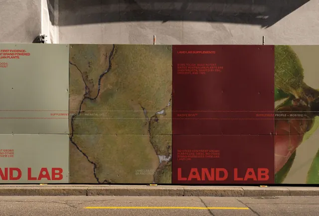
Modular environmental branding panel with muted earth tones, topographic map, and overlaid text in deep red and beige, communicating research and sustainability.
Summary
Modular environmental branding panel with muted earth tones, topographic map, and overlaid text in deep red and beige, communicating research and sustainability.
Visual description
A wall-mounted installation of rectangular panels arranged in a linear grid. Each panel features a muted palette of olive green, deep maroon-brown, and cream beige. One section shows a topographic map with subtle contour lines (environmental or geographical focus). Others display all-caps sans-serif text in deep red and beige, with structured line breaks and dotted dividers suggesting scientific data or process flow. The materials appear textured (concrete or similar), and the overall composition reads as institutional, research-driven, and disciplined. Soft natural light reveals depth and surface texture, reinforcing the serious, environmental tone.
Key takeaway
The paired color strategy of deep red and olive-green against cream, which feels both serious and warm. The use of topographic visual language to signal environmental consciousness. The modular grid approach that allows content to expand or contract without losing visual coherence. The all-caps sans-serif in relatively small scale, which suggests formal documentation rather than marketing.
Reuse notes
Strong reference for environmental organizations, scientific institutions, research facilities, and sustainability-focused brands. The earth-tone palette and cartographic imagery work especially well for nonprofits and education sectors. The modular panel approach is ideal for wayfinding systems or campus identities. Can feel austere without supplementary imagery or color; pairs well with photography of natural landscapes or research in action. Less suitable for playful or high-energy contexts.
More like this


Keep what you find
A free account saves references to boards and can send you a weekly email of picks based on what you save.
To see every result, go Pro.