Preview image. Unlock full-res
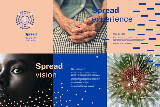
Multi-panel abstract brand identity layout pairing warm peach tones with deep blue, organized as a modular vision system.
Summary
Multi-panel brand identity layout pairing peach and navy in a modular system, anchored by geometric dot patterns and authentic hand photography.
Visual description
Six asymmetric panels arranged in a 2x3 grid showcase distinct brand moments. Top left: a navy dot-matrix circle on soft peach background with "Spread prosperity solutions" label. Top center and right: warm-toned hands clasping on checkered fabric with "Spread experience" headline in navy and accent bars. Bottom left: black-and-white close-up portrait in navy frame with "Spread vision" and gold accent squares. Bottom center: navy ground with white modular text blocks and scattered gold squares on "Our message." Bottom right: macro plant photo with green spikes and "Our purpose" label. The design unifies through a palette of peach, navy, white, charcoal, and bronze, using sans-serif type and geometric patterns as the connective language.
Key takeaway
The modular panel approach creates visual interest while maintaining grid discipline. Authentic photography (hands, portrait, plant macro) contrasts sharply with geometric abstraction and solid color blocks, avoiding sterility. The selective use of gold squares as rhythm breaks elevates what could be basic information hierarchy.
Reuse notes
Strong reference for fintech or B2B consulting decks that need warmth without sacrificing precision. The peach-navy pairing reads both approachable and authoritative. Works well for vision/values presentations where you want to pair data-heavy sections with human-centered photography.
More like this








Keep what you find
A free account saves references to boards and can send you a weekly email of picks based on what you save.
To see every result, go Pro.