Preview image. Unlock full-res
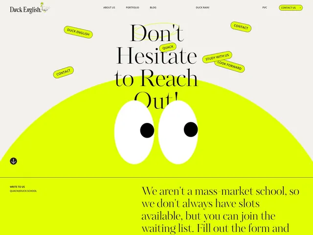
Education-focused landing page with oversized serif headline, neon-yellow background shape, and scattered pill-shaped label callouts on hero section.
Summary
Education branding for Duck English featuring a confident serif headline anchored by a large neon-yellow organic shape with simple eye illustration, surrounded by yellow pill-shaped label callouts.
Visual description
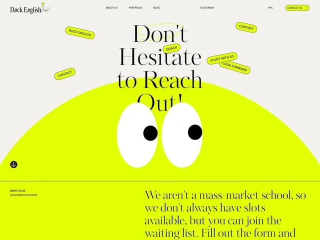
A desktop landing page with a light neutral background (off-white) containing a large serif headline "Don't Hesitate to Reach Out" in black type with a bright yellow underline accent. Below sits a large organic yellow shape dominating the lower half, illustrated with two simple white circles and black pupils forming a playful eye pair. Throughout the composition, scattered yellow pill-shaped labels containing text (Contact, Study With Us, Look Forward, Quack) act as floating callouts. The top navigation shows Duck English branding with their duck mascot, links (About Us, Portfolio, Blog, Duck Rain), language selector, and a bright yellow Contact Us button. The layout emphasizes friendly directness and approachability through high contrast and informal annotation-style labels.
Key takeaway
The combination of a bold geometric shape as a container for visual interest paired with scattered label callouts that humanize institutional messaging. The neon yellow as a functional accent that also creates warmth and personality.
Reuse notes
Effective for education, SaaS onboarding, or friendly institutional contexts. The playful illustration and scattered labels work well for encouraging user action. Avoid when formality or minimalism is required; the bright yellow works best on light backgrounds.
More like this


Keep what you find
A free account saves references to boards and can send you a weekly email of picks based on what you save.
To see every result, go Pro.