Preview image. Unlock full-res
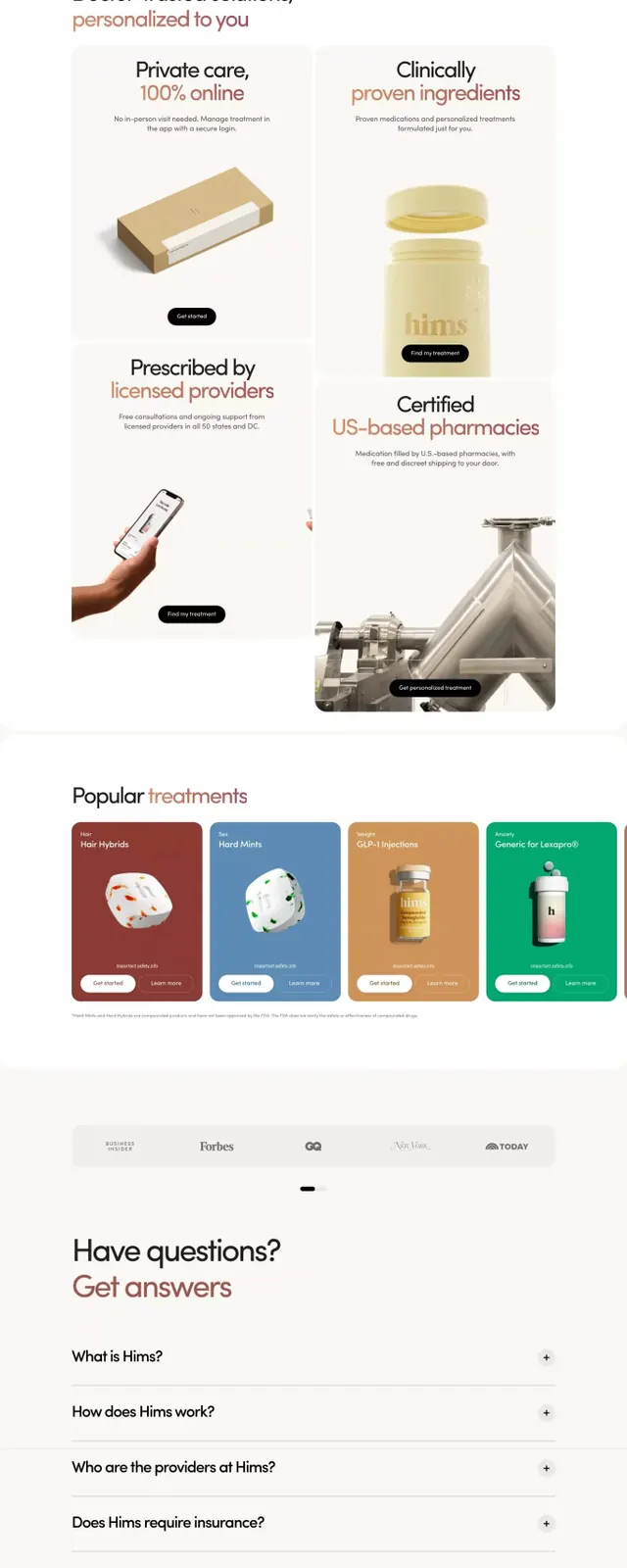
Full-page healthcare service design with rotating photo hero cards, tabbed selector, product imagery, testimonial cards, and FAQ section on light background.
Summary
Multi-section landing page for a telemedicine service combining photo hero cards, tabbed treatment selector, product imagery, testimonial cards, FAQ, and dark footer.
Visual description
Off-white background with generous padding. Header leads with a headline "Convenient, quality care 100% online" and icon-labeled tabs (Hims anxiety, Regular visit, Loss weight, etc.). Three photo hero cards below showing male users with treatment category labels in warm earthy tones (burgundy, steel, charcoal). "A simple way to feel great" section with large product photography (bottles, packaging) and supporting copy. Testimonial cards in a grid (burgundy, blue, tan backgrounds) with photo, name, quote. FAQ accordion below. Dark navy footer with logo and links. Throughout, soft neutral palette with muted sage and tan accents; generous white space between sections.
Key takeaway
The tabbed selector simplifying treatment choice upfront, combined with hero cards reassuring through authentic user imagery. The earthy warm tones (burgundy, caramel, sage) convey care without feeling clinical. Consistent icon labels across sections unify diverse content types.
Reuse notes
Strong for healthcare, wellness, or consumer-app landing pages. The mix of photo authenticity with clean information architecture avoids both cold clinical and overly trendy feels. Works best when the brand story centers on accessibility or convenience.
More like this



Keep what you find
A free account saves references to boards and can send you a weekly email of picks based on what you save.
To see every result, go Pro.