Preview image. Unlock full-res
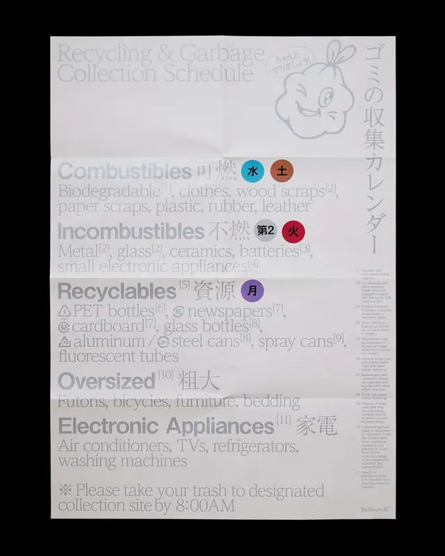
Dense, multi-column instructional document with color-coded categories and Japanese text and icons for waste-disposal sorting.
Summary
A dense public-service instructional guide written in Japanese, organized into color-coded waste categories with icons, icons, and multi-column text for disposal sorting rules.
Visual description
Light-gray background with a large off-white or pale-yellow central panel organized in four distinct color-coded sections: "Combustibles" (with blue and red icons), "Incombustibles" (with red and maroon icons), "Recyclables" (with blue icon), and "Oversized" (with larger icons). Japanese-language descriptive text fills each section in dense, justified columns. Small icons appear next to category headings. English text at bottom reads "Please take your trash to designated collection site by 8:00AM." A Japanese rabbit or mascot character appears in top right. Typography is utilitarian sans-serif, optimized for legibility of dense information.
Key takeaway
Color coding creates instant visual separation of categories without adding complexity; dense, justified text layout efficiently packs information; icons and simplified graphics break up text and provide quick visual reference; utilitarian typography remains legible even at small scale.
Reuse notes
Essential reference for any instructional, public-service, or regulatory design system. Works across languages and cultural contexts where visual hierarchy and density matter more than aesthetic polish. Pair with clear iconography and restrained color palette. Ideal for government, municipal, and healthcare materials where functional clarity is the priority.
More like this

Keep what you find
A free account saves references to boards and can send you a weekly email of picks based on what you save.
To see every result, go Pro.