Preview image. Unlock full-res
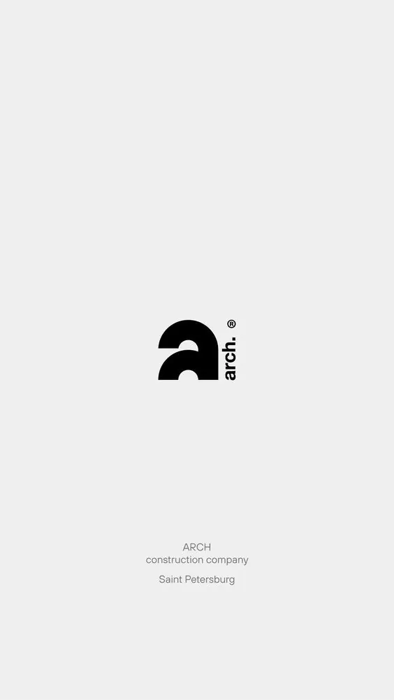
Minimal black-on-white logo mark for Arch construction company, with registered trademark and sans-serif wordmark centered on light gray background, company descriptor and location below.
Summary
Minimal construction-company branding: geometric black arch/semicircle mark with registered trademark, sans-serif wordmark positioned vertically to the right, centered on light gray background with company descriptor and location below.
Visual description
Centered logo mark on light gray background. The logo comprises a stylized black geometric arch shape (two parallel curved segments forming an abstract house or architectural frame) paired with vertical-axis "arch." text in lowercase sans-serif. A small registered-trademark circle sits top-right of the wordmark. Below the logo, centered text reads "ARCH" in caps, then "construction company" in smaller gray sans-serif, and finally "Saint Petersburg" in lighter gray italics. The composition is perfectly centered with ample negative space, emphasizing the mark's geometric precision and stability.
Key takeaway
Geometric arch mark feels architectural without being literal or heavy. Vertical-axis wordmark pairing creates upright, stable impression. Subtle hierarchy through caps, size, and color (black, gray, light gray) reads at multiple distances without additional visual noise. Registered trademark signals professional brand maturity.
Reuse notes
Excellent template for construction, real-estate, or engineering B2B brands. The geometric abstraction scales well from business card to building signage. Reserve for brands where stability, precision, and modernism are core values. Light gray background is necessary to distinguish the white space from the architecture mark.
More like this



Keep what you find
A free account saves references to boards and can send you a weekly email of picks based on what you save.
To see every result, go Pro.