Preview image. Unlock full-res
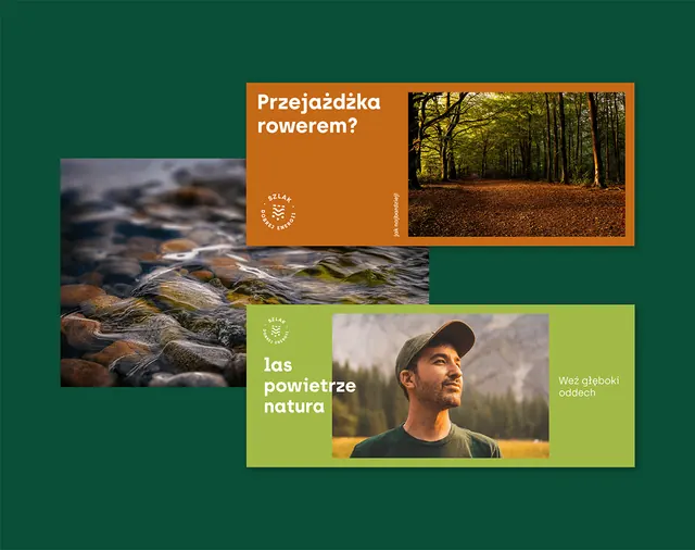
Earthy color palette with deep forest green, burnt orange, and olive, arranged as photographic and solid-color cards promoting outdoor tourism and nature exploration.
Summary
Outdoor education content system mixing photographic and solid-color cards in earthy tones to invite exploration and convey environmental information in an approachable grid.
Visual description
Layout on deep forest-green background composed of four rectangular cards. Top-left card is warm burnt orange with white text "Pozosadka rozmiem?" and an icon, overlaying a horizontal photographic strip of forest canopy. Top-right card features a landscape photograph of a woodland path with soft warm lighting. Bottom-left card is moss-green with white and beige typography including an activity icon, describing outdoor nature experiences. Bottom-right card uses solid tan-brown with muted green accent text and a small icon system. All cards have generous whitespace within, employ identical sans-serif typography for consistency, and use a restrained palette of deep green, orange, olive, and earth-brown tones to evoke soil, forest, and natural settings.
Key takeaway
The way earthy, analogous colors create visual unity without feeling flat or boring. Using photography and solid color fields in equal measure keeps the design from becoming image-heavy or text-dense. The modular card approach scales easily for multiple topics while the color palette alone signals the nature/outdoor category.
Reuse notes
Ideal for environmental organizations, outdoor education platforms, travel guides, and sustainability initiatives targeting a wide audience (families, students, explorers). Works well on digital and print. The dark background makes the cards pop but ensure text contrast is strong. Consider this approach when you need to present multiple related topics with equal visual weight.
More like this

Keep what you find
A free account saves references to boards and can send you a weekly email of picks based on what you save.
To see every result, go Pro.