Preview image. Unlock full-res
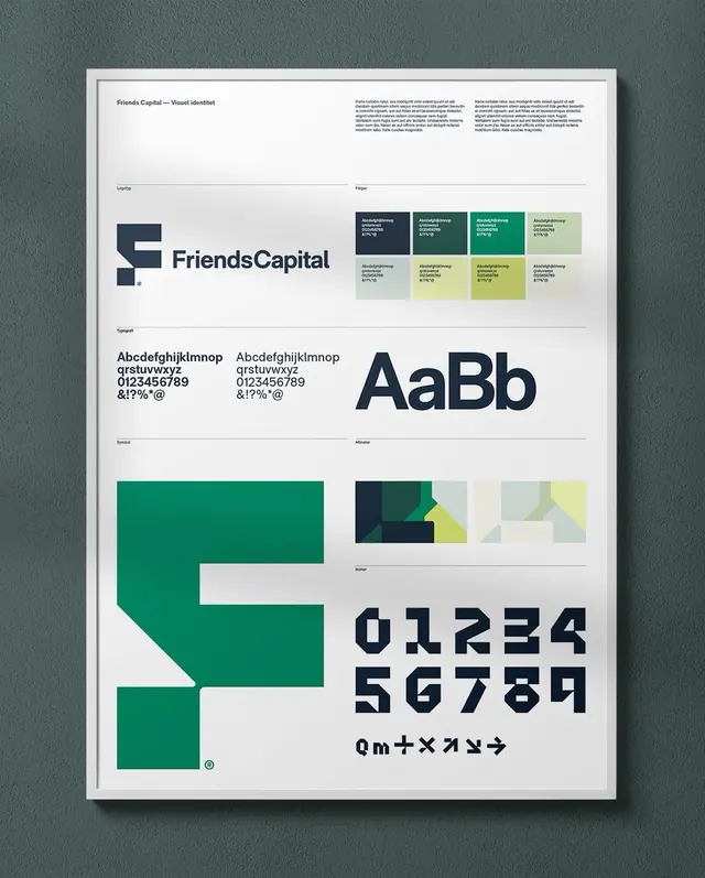
A brand identity reference sheet showcasing a fintech company's logo system, color grid, typeface, and geometric mark variations on a single printed page.
Summary
A printed brand guideline sheet for Friends Capital, displaying the company's primary logo, color palette grid (six colors in navy, teal, sage, and cream), sans-serif typeface family, and geometric mark system against cream-white.
Visual description
A single page reference sheet on cream stock documents the Friends Capital identity. The layout uses abundant white space and grid-based organization. A multi-color geometric logo sits left-center (a tilted square form in navy and teal). "Friends Capital" wordmark in a dark sans-serif occupies the top-right. A six-swatch color palette is arranged below the logo: four navy/teal blocks across the top row, two sage/cream in the lower row. Typeface specimens show a sans-serif in both narrow condensed and regular widths, with full alphanumeric glyphs and special characters. A second geometric mark system shows variations: a solid navy square, a two-tone teal-yellow rectangle, and another abstracted mark in cream and pale yellow. All typeset in a compact sans-serif, labels are minimal and aligned left. The overall effect is hierarchical, structured, and restrained.
Key takeaway
A compact, printable identity sheet format that communicates color, type, and logo in one view without clutter. The use of a color grid (swatches vs free-floating blocks) makes palette selection clear. Pairing multiple mark variations on a single sheet shows flexibility without overwhelming. Abundant space around elements aids legibility on reduced scale.
Reuse notes
Ideal as a brand-guideline reference for fintech, corporate, or conservative b2b. Works best when colors are legible and distinct (avoid tight saturation). The layout scales down well for PDFs or internal-guide printouts. Strong when the typeface itself is a strong, narrow sans-serif; would feel generic with a neutral font.
More like this







Keep what you find
A free account saves references to boards and can send you a weekly email of picks based on what you save.
To see every result, go Pro.