Preview image. Unlock full-res
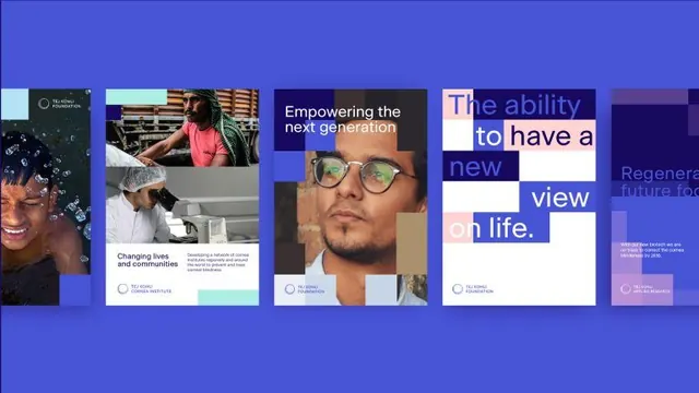
Four equal-width cards with stark photo blocks and stacked text, unified by bold sans-serif headlines and a bright-blue glow background, conveying social empowerment themes.
Summary
Four equal-width cards presented against a luminous blue gradient, each combining a full-height portrait photograph with a white text overlay declaring an empowerment statement. The typographic approach uses a heavy sans-serif headline broken across multiple lines and left-aligned, with a small circular logo lockup beneath.
Visual description
The background is a radial blue glow that anchors the composition. Each card is a vertical rectangle containing a full-width color photograph (diverse portraits, hands working) overlaid with a semi-transparent white box in the lower third. Type sits inside this white zone: a heavy, chunky sans-serif (all-caps or display weight) headlines the theme, lines are broken dramatically for rhythm, and a small circular identity mark (repeated across all four cards) sits below in a consistent position. The cards appear identically sized and equidistant. The fifth card on the right is partially cropped and glowing, suggesting continuation or iteration.
Key takeaway
The stacking of photography + type blocks into a uniform grid reinforces brand cohesion while letting each card's message stand alone. The consistent position and size of the logo mark across all cards anchors the visual system. Breaking headlines into unexpected line breaks creates visual interest without added decoration. The translucent white type box ensures legibility over any photograph.
Reuse notes
Strong for nonprofits, advocacy, social-impact brands, and diversity-forward campaigns. The four-card grid format works well for a hero or a primary content section. Ensure photographs have visual interest on their own since the text is semi-transparent. The blue-glow background reads as digital-native, not print.
More like this

Keep what you find
A free account saves references to boards and can send you a weekly email of picks based on what you save.
To see every result, go Pro.