Preview image. Unlock full-res
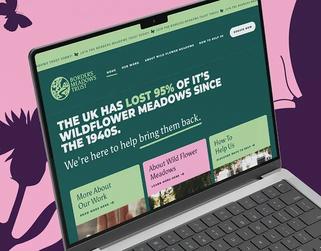
Laptop mockup of an environmental nonprofit website using deep forest green and soft pink accents to convey sustainability and conservation focus.
Summary
Laptop mockup of a conservation-focused website using deep forest green as the primary color with soft pink accent blocks, white card sections, and clean typography to communicate environmental trustworthiness.
Visual description
A gray laptop mockup sits angled on a soft pink and purple background. The website screen shows a dark forest-green navigation bar at top with white text. Below is a prominent headline section in white type against the green, followed by a grid of card-based content sections. Some cards are white, others light sage green, with soft pink blocks interspersed as accent areas. The color blocking is organized and calm. White space between cards ensures readability. Sans-serif type throughout, appearing modern and accessible. The overall impression is structured, hopeful, and serious about environmental mission. Deep green conveys nature and stability; pink accents add warmth and approachability.
Key takeaway
Pairing a strong primary color (dark green) with a warm secondary accent (soft pink) creates visual interest while maintaining professionalism. Card-based layout with generous white space prevents information overload. The deep green feels environmental without cliche imagery. Pink humanizes a serious topic. Typography is the only structural element needed beyond color blocking.
Reuse notes
Strong default for nonprofits, conservation organizations, sustainability platforms, or mission-driven brands. The deep green plus pink palette works for organizations addressing climate, nature, or social impact. Card layouts scale from desktop to tablet to mobile. Avoid saturated greens (this works because the green is muted, forest-toned). The color blocking should follow content hierarchy, not decorate randomly. Works best with 3-6 cards per row; more than six breaks the rhythm.
More like this




Keep what you find
A free account saves references to boards and can send you a weekly email of picks based on what you save.
To see every result, go Pro.