Preview image. Unlock full-res
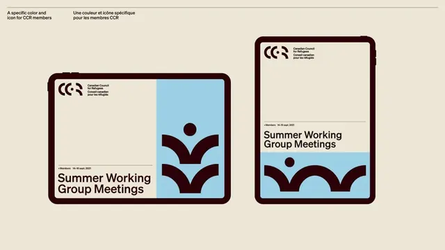
Institutional brand application showing two card formats with dark brown borders, cream background, light blue accent panels, and geometric icon system for a cultural organization.
Summary
Two versions of an event-card template showing structured brand system application: dark rounded-corner frames with cream interiors, light blue gradient accent blocks, and a consistent geometric mark and typography hierarchy.
Visual description
Side-by-side presentation of two event-card layouts on a cream background. Each card has a heavy dark brown rounded border (approximately 16-20px radius) enclosing the design area. The left card features a light blue gradient panel with a geometric symbol (three stacked curved shapes, suggesting movement or growth), paired with dark sans-serif text below reading "Summer Working Group Meetings" plus metadata line. The right card uses the same structure but mirrors the accent panel to the lower half. Both employ a restrained palette of cream, dark brown, and light blue, with consistent sans-serif typeface across all text, varying weight to establish hierarchy.
Key takeaway
The asymmetric accent-panel placement (full height left, bottom-aligned right) creates visual interest while maintaining structural consistency. The geometric icon system is distinctive and scalable. The thick rounded-corner frame becomes the primary brand identifier, more prominent than color.
Reuse notes
Strong for official or institutional identity applications. The structure works well for hierarchical information (dates, categories, metadata) paired with visual marks. Best suited to paper, digital documents, or formal event communications where formality and clarity are priorities.
More like this



Keep what you find
A free account saves references to boards and can send you a weekly email of picks based on what you save.
To see every result, go Pro.