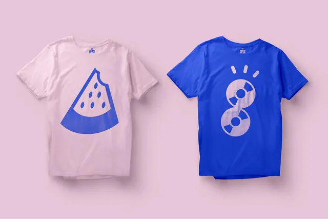
Preview image. Unlock full-res
A two-color palette composition contrasting a soft mauve-pink tone with a rich deep blue, demonstrating sophisticated color harmony through complementary warmth and coolness.
Summary
A bold two-color palette combining a desaturated mauve-pink (#DEBDCE) with a vibrant deep cobalt blue (#2442C7), creating strong visual contrast through hue separation and saturation variance.
Visual description
This minimal color study presents two primary colors rendered as distinct swatches or blocks. The mauve-pink is soft, slightly desaturated, and warm—suggesting luxury, approachability, or softness. The cobalt blue is saturated and deep, conveying energy, trust, or boldness. The contrast between the two creates dynamic visual tension: the warm, muted tone against a cool, vibrant one. This pairing is often seen in contemporary entertainment and media design where brand personality requires both approachability and impact.
Key takeaway
A desaturated warm tone paired with a saturated cool accent creates memorable, sophisticated color relationships without feeling chaotic. The mauve grounds the palette in elegance while the blue provides energetic pop. This combination feels contemporary and works well for entertainment or lifestyle branding.
Reuse notes
Perfect for entertainment, music, media, or lifestyle branding. The mauve works well for backgrounds, large type, or premium UI elements while the blue excels as accent color for buttons, links, or highlights. Pair with contemporary sans-serif type. The combination feels youthful yet sophisticated—ideal for music streaming, content platforms, or Gen-Z focused brands. Works well in full-screen hero sections or as primary brand colors in digital products.
More like this


Keep what you find
A free account saves references to boards and can send you a weekly email of picks based on what you save.
To see every result, go Pro.