Preview image. Unlock full-res
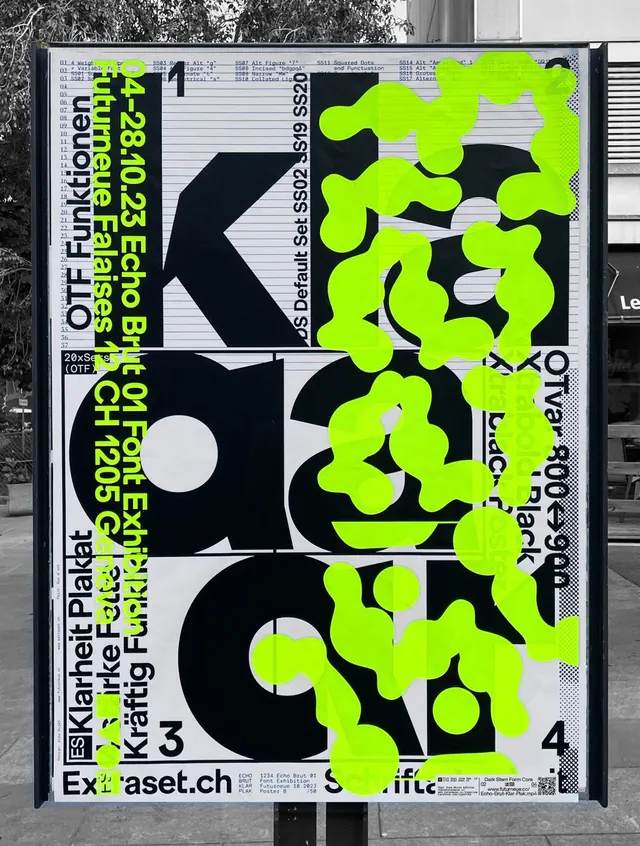
A color palette composition featuring a sophisticated mix of dark charcoal, bright lime green, muted sage green, and light gray, demonstrating bold-and-muted color relationships.
Summary
A five-color palette combining a dark charcoal foundation, warm grays, a vibrant lime-green accent, and a muted sage green, showcasing a contemporary approach to color harmony through high-contrast saturation variation.
Visual description
The palette is organized as a structured color study with five distinct hues rendered as swatches or blocks. The foundation is established by very dark charcoal (#11181A), paired with a neutral light gray (#C6C9CC). The accent color is a bright, almost neon lime-green (#A6F20C) that creates significant contrast against the dark base. Two additional greens—a cool mid-gray (#57595C) and a muted, desaturated sage green (#8EA36C)—bridge the gap between the bold accent and the neutral foundation. The palette demonstrates sophisticated color theory: a neutral base, a bold accent for energy, and tertiary colors that feel intentional and considered.
Key takeaway
Pairing a neon accent with desaturated and neutral companions creates a palette that feels modern and energetic without chaos. The earthy sage and cool grays provide breathing room around the bright lime, allowing the accent to feel purposeful rather than overwhelming.
Reuse notes
Excellent for tech product interfaces, contemporary branding, or editorial design systems. The lime green works well as a highlight or call-to-action color on dark backgrounds. The sage and warm grays are ideal for secondary UI elements, text, or spacer zones. This palette pairs naturally with geometric or minimalist typography. Works well in dark mode interfaces. Consider using the bright green sparingly for maximum impact.
More like this




Keep what you find
A free account saves references to boards and can send you a weekly email of picks based on what you save.
To see every result, go Pro.