Preview image. Unlock full-res
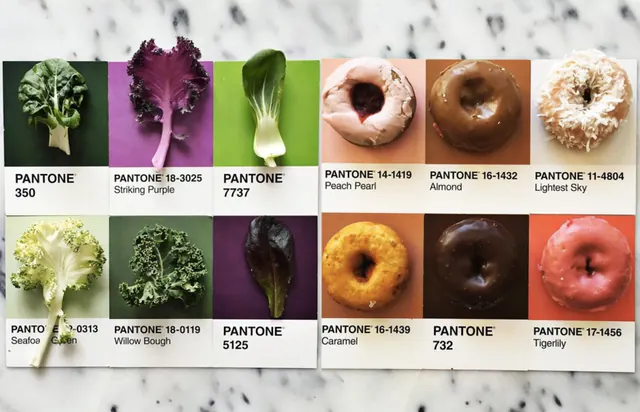
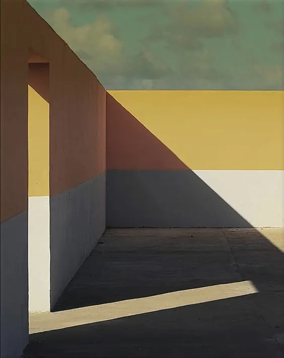
Color palette display with Pantone swatches arranged horizontally in muted earth and warm tones.
Summary
A horizontal Pantone color palette composition displaying five coordinated color swatches in warm, earthy tones ranging from light beige to deep brown.
Visual description
Five color swatches arranged horizontally in a 900x580px landscape composition. The palette progresses through warm, muted tones: light beige (#DED8D1) at 39%, deep brown (#383026) at 39%, russet red (#944C41) at 13%, warm ochre (#A38F48) at 8%, and taupe (#8C8C84) at 1%. The balanced composition with nearly equal dominance of the light and dark tones creates visual harmony. Horizontal format suggests web/presentation use.
Key takeaway
A well-curated earth-tone palette demonstrating how warm, muted colors can work together for sophisticated, professional applications. The 40-40-13-8-1 distribution shows restraint in accent color usage.
Reuse notes
Perfect reference for warm, earthy design palettes in branding, editorial design, or interior design projects. The neutral-to-warm progression works well for luxury, artisanal, or heritage brand identities. Use for color inspiration in web design, print collateral, or packaging where understated sophistication is desired.
More like this




Keep what you find
A free account saves references to boards and can send you a weekly email of picks based on what you save.
To see every result, go Pro.