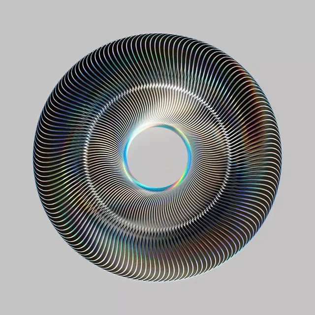
Preview image. Unlock full-res
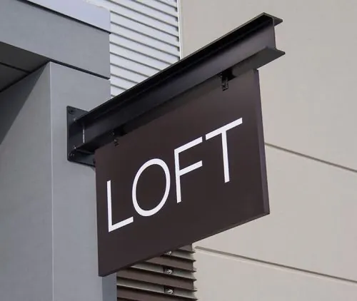
A balanced, monochromatic composition in shades of gray suggesting a contemporary graphic design or typography study with elegant simplicity.

Summary
A beautifully balanced grayscale composition exploring neutral tones and subtle tonal relationships, suggesting a design study or contemporary minimalist aesthetic.
Visual description
Roughly 50% dark charcoal (#2D2E2E), 46% light warm gray (#C2C2C0), with a small accent in mid-gray (#79807F, ~2%). The palette is exquisitely limited and balanced, avoiding pure black or white. The aspect ratio is 1:1 (square), suggesting a logo, icon system, or conceptual study. The overall mood is one of restraint and sophistication.
Key takeaway
Limiting a palette to three grays forces designers to explore subtle tonal relationships and contrast through form alone. This constraint yields elegant, timeless results that work across scales.
Reuse notes
Perfect reference for minimalist branding, design systems, or typography-focused work. The neutral palette is infinitely reusable and pairs well with any accent color. Works in print, digital, and environmental contexts. Particularly strong for luxury, tech, or editorial applications.
More like this


Keep what you find
A free account saves references to boards and can send you a weekly email of picks based on what you save.
To see every result, go Pro.