Preview image. Unlock full-res
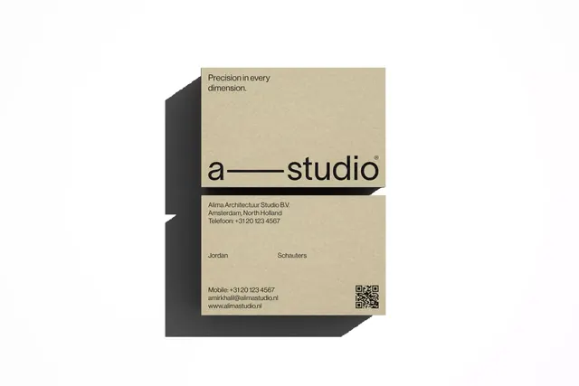
Minimalist architecture studio business card with cream background, sans-serif headline type, contact details, and a striking dark isometric 3D shadow creating depth on a white backdrop.
Summary
An architecture studio business card using minimal cream-and-black branding with a dramatic isometric 3D shadow effect that creates perceived depth from a simple angular dark form.
Visual description
The card face is light cream with dark sans-serif and serif type. The studio name "a—studio" appears as a display headline with a distinctive em-dash separator in a confident, clean typeface. Above sit the words "Precision in every dimension." Contact details, principal names (Jordan, Schauters), phone, mobile, email, and URL are set in smaller sans-serif in dark gray. A QR code sits in the bottom right. The card's left edge is anchored by a large, geometric dark charcoal isometric shadow that extends from the card surface at an angle, creating the illusion the card is lifting off the white background. The shadow is a simple blocky shape with clean edges, relying purely on form and darkness for effect. No color, no gradients, no additional graphics.
Key takeaway
The isometric shadow is a powerful one-element trick that conveys premium, three-dimensional sophistication without complexity. The em-dash in the studio name breaks the visual monotony of an all-sans layout. Keeping everything monochrome forces precision in spacing and type choice.
Reuse notes
This approach works especially well for professional services, design studios, and architecture firms where craft and precision matter. The isometric shadow technique is cost-effective to execute in print or digital. Works best as a 3D mockup or physical card where the shadow's perspective reading is clear; on flat screens it needs thoughtful lighting or shadow rendering to read as intentional depth.
More like this




Keep what you find
A free account saves references to boards and can send you a weekly email of picks based on what you save.
To see every result, go Pro.