Preview image. Unlock full-res
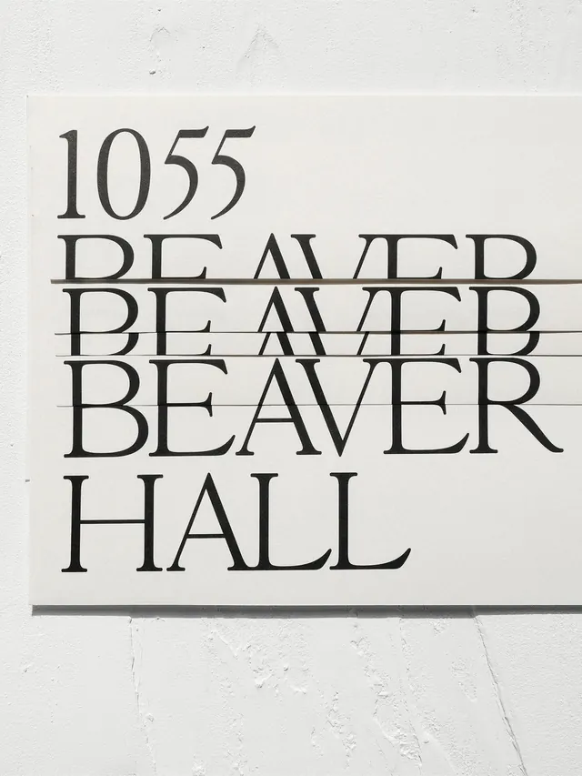
Architectural wayfinding signage featuring a year and repeated address text in tall, stacked serif typography on a white painted concrete wall.
Summary
A minimalist architectural wayfinding sign combining a year and address text in a clean serif typeface, stacked vertically with refined line spacing and painted on textured white concrete.
Visual description
White textured concrete wall surface features black serif text reading "1055 / BEAVER / BEAVER / BEAVER / HALL" with each line treated as a separate layer. A thin gray horizontal rule bar sits below the main address. The type is centered, evenly spaced, and uses a condensed or compressed serif face reminiscent of Garamond or similar classic serifs. Text is crisp and precise against the rough concrete substrate, which has visible cracks and weathering, creating slight visual tension between the refined typography and raw surface.
Key takeaway
Elegant type hierarchy using repetition and stacking to create rhythm and legibility. Pairing refined serif typography with raw concrete surfaces creates sophistication through contrast. The minimalist approach to wayfinding demonstrates clarity without ornament.
Reuse notes
Excellent reference for architectural signage, wayfinding systems, or editorial design requiring understated elegance. Works for cultural, institutional, or boutique retail contexts. The stacked typography technique is adaptable for addresses, institutional names, or directional systems. Pairs well with modern minimalist interiors.
More like this



Keep what you find
A free account saves references to boards and can send you a weekly email of picks based on what you save.
To see every result, go Pro.