Preview image. Unlock full-res
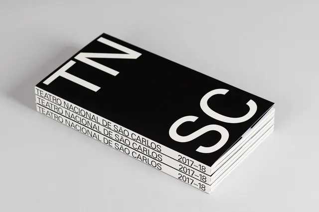
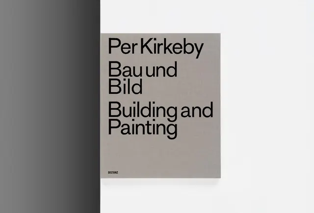
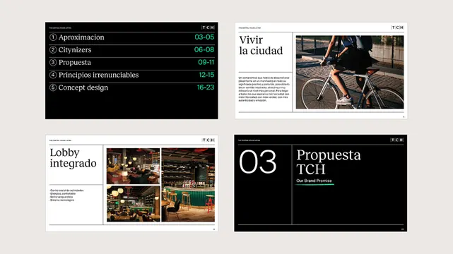
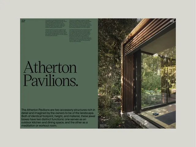
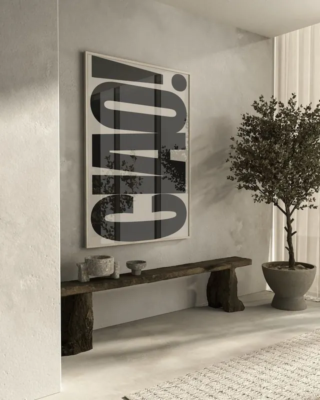
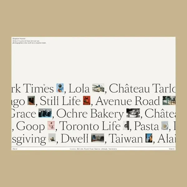
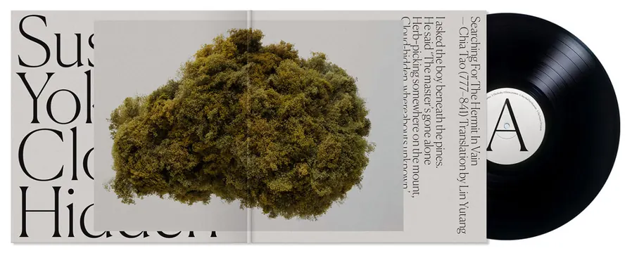
A minimalist composition layering serif type and geometric forms in warm grays, beige, and deep mauve tones.
Summary
A minimalist composition layering serif type and geometric forms in warm grays, beige, and deep mauve tones.
Visual description
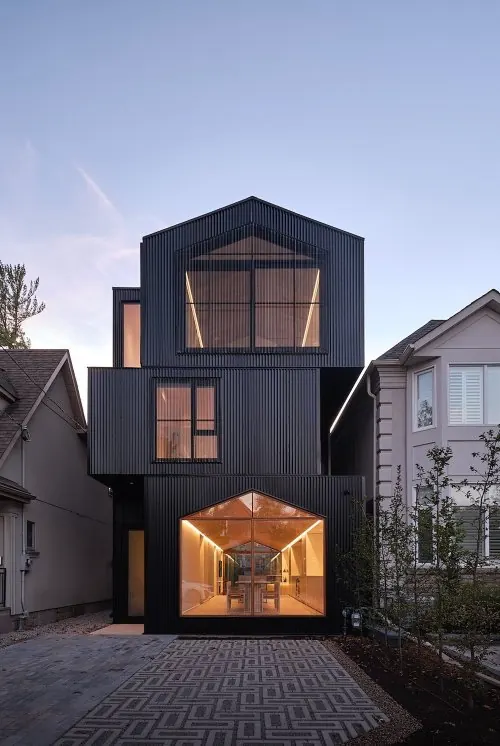
The image presents a visually cohesive composition rendered in the described color palette. The aesthetic emphasizes editorial, minimal, typographic qualities, with warm, muted, monochrome tones creating a calm and editorial mood. Typography and composition are clean and intentional.
Key takeaway
The effective use of a limited, harmonious color palette to create visual unity. The restraint in form and color demonstrates how muted, earthy, or cool tones can convey sophistication and professionalism in design.
Reuse notes
Suitable for design systems, brand guidelines, editorial layouts, and minimalist projects. The warm/earthy variants work well for luxury or lifestyle brands; cool/muted variants suit tech or professional sectors. Use as inspiration for color harmony, material studies, or typographic positioning.