Preview image. Unlock full-res
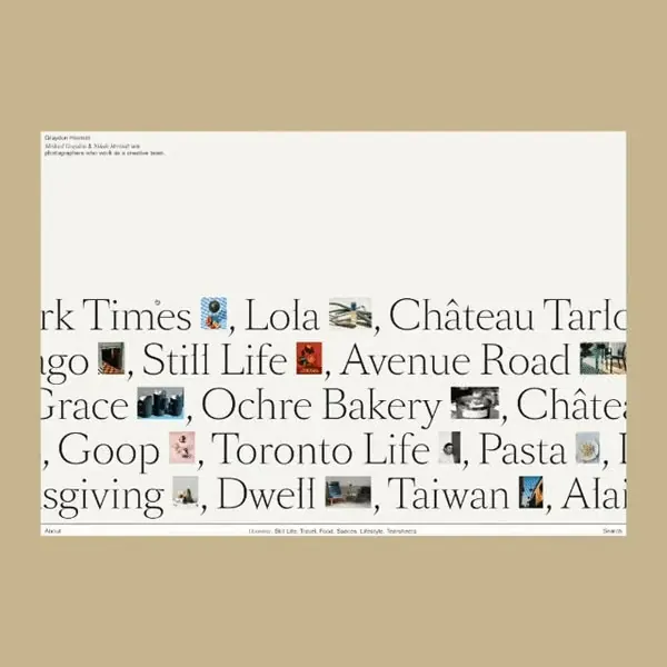
Dense publication list in serif typeface set against a warm taupe background, displaying a curated index of editorial titles as a unified typographic composition.
Summary
A serif-typeface publication list displayed as a unified typographic composition against a warm taupe background, treating title names as both content and graphic element.
Visual description
A cream-colored card mounted on a warm tan background displays flowing lines of publication titles in a large serif font, left-aligned with generous line spacing. The text flows continuously without bullet points or numbers, creating a rhythmic, almost poetic reading experience. Small square photographic thumbnails in muted colors punctuate the text at irregular intervals, breaking the monotony without calling attention. The overall effect is quiet and archival, like a gallery index or exhibition catalog. Typography is the primary visual tool, with micro-imagery serving as subtle rhythm markers.
Key takeaway
Using serif display type as the dominant visual element, not decoration. The integration of small supporting images at variable intervals creates visual interest without disrupting the flow. The generous line spacing and left-alignment feel generous and readable at body copy size, trading density for elegance.
Reuse notes
Ideal for publication directories, exhibition catalogs, gallery indexes, or portfolio pages where titles matter more than images. Works best in editorial and cultural contexts. Requires genuinely curated content, not mass lists, to feel intentional.
More like this


Keep what you find
A free account saves references to boards and can send you a weekly email of picks based on what you save.
To see every result, go Pro.