
Preview image. Unlock full-res
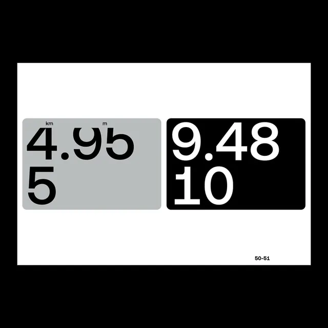
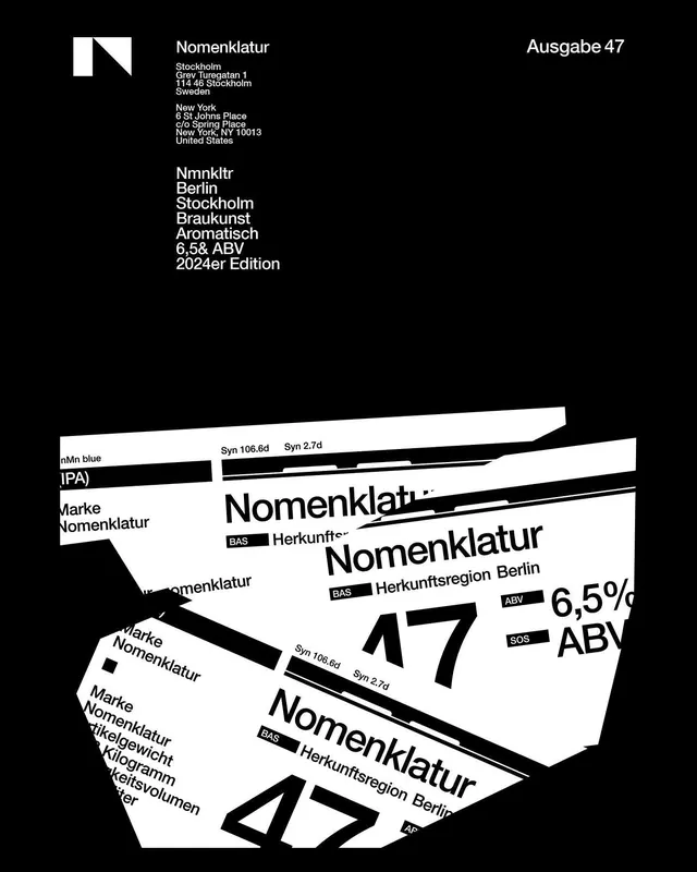
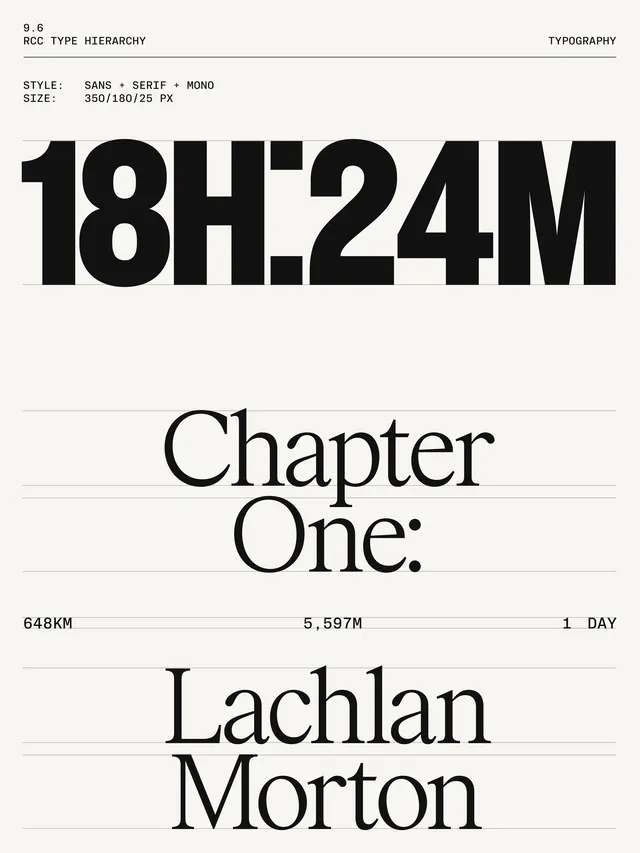
A structured presentation of information through visual hierarchy, icons, and organized typography, emphasizing clarity and understanding.
Summary
A structured presentation of information through visual hierarchy, icons, and organized typography, emphasizing clarity and understanding.
Visual description
A complex infographic layout organized into clear sections or columns, likely 2-3 columns. Uses a combination of typographic hierarchy, icons, and possibly small charts or diagrams to communicate information. Black typography on white or light gray background. Icons act as visual anchors for different categories. Information is presented in a logical, top-to-bottom flow with clear visual breaks between sections. Clean sans-serif fonts emphasize legibility and professionalism.
Key takeaway
Systematic visual hierarchy using size, weight, color, and position. Icons as semantic shortcuts reducing text density. Grid-based layout that organizes complex information into digestible chunks.
Reuse notes
Essential for B2B, education, reports, or any content-dense context. The structured layout supports scanning and quick comprehension. Monochrome palette limits visual distraction. Requires substantial content to justify the grid—risks feeling empty if information is light.
More like this



Keep what you find
A free account saves references to boards and can send you a weekly email of picks based on what you save.
To see every result, go Pro.