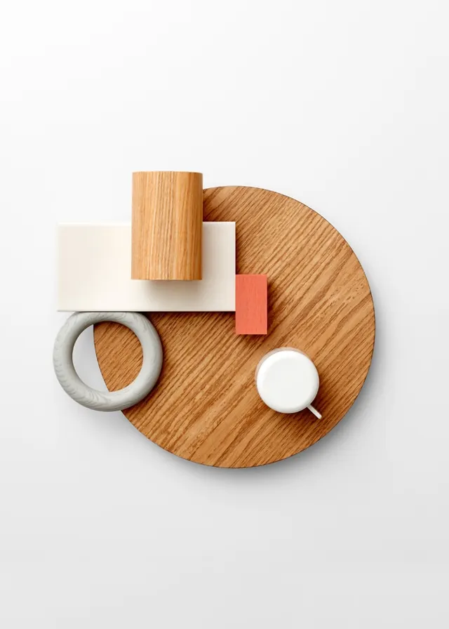
Preview image. Unlock full-res
A minimalist editorial layout combining typography with a high-end luxury car image, using a neutral gray palette with bold type treatment.
Summary
A minimalist editorial layout combining typography with a high-end luxury car image, using a neutral gray palette with bold type treatment.
Visual description
A vertical editorial layout featuring a sophisticated automotive photograph on the right side showing a luxury car in warm metallic tones against a light background. The left half contains bold sans-serif typography in dark gray and warm brown tones, with hierarchical text arrangement. The overall composition uses generous white space, creating a premium, gallery-like aesthetic. The color palette shifts from warm beiges and taupes to rich copper and bronze accents.
Key takeaway
Balancing photography with substantial typographic content using asymmetric layout. The discipline of limiting the color palette to warm neutrals and one bronze accent. Using the photograph as a secondary visual element rather than the hero.
Reuse notes
Strong for automotive, luxury goods, or premium brand editorials. Requires a genuinely high-quality product/lifestyle photograph to balance the text-heavy left side. The warm neutral palette limits versatility—works best for luxury/warmth positioning, not tech/cool brands.
More like this

Keep what you find
A free account saves references to boards and can send you a weekly email of picks based on what you save.
To see every result, go Pro.