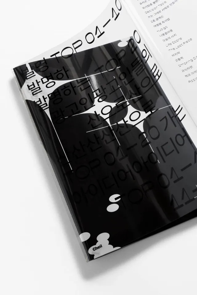
Preview image. Unlock full-res
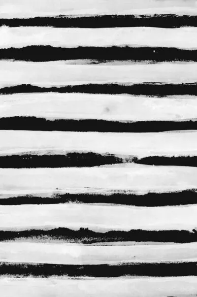
Minimal two-tone composition with very light gray background and near-black text or shapes, clean and readable.
Summary
A restrained grayscale composition using light gray and near-black with minimal mid-tone accent, prioritizing clarity and legibility.
Visual description
Light gray (#E6E6E6) forms the dominant background, occupying roughly 63% of the image. Nearly black (#1C1B1C) provides sharp contrast for primary content (likely text or main shapes), while a subtle mid-gray (#6D6D6E) appears as minimal accent. The tonal discipline suggests editorial, web, or UI-focused design—layouts where hierarchy and readability are paramount.
Key takeaway
Extreme tonal separation ensures that whatever sits on the light background (text, shapes, interface elements) reads with absolute clarity. The tiny mid-tone allows for nuanced secondary information without cluttering.
Reuse notes
Ideal for editorial, corporate, tech, or minimalist consumer design. Pairs naturally with sans-serif type. The light background prevents visual fatigue in text-heavy layouts. Works well for apps, clean web design, or documentation-style materials.
More like this





Keep what you find
A free account saves references to boards and can send you a weekly email of picks based on what you save.
To see every result, go Pro.