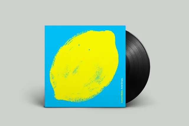
Preview image. Unlock full-res
Soft greige background with a striking teal-blue primary and bright yellow-green accent, playful but balanced.
Summary
A geometric composition balancing a calm greige field with a vivid teal primary and bright chartreuse accent, creating energy without chaos.
Visual description
Soft, muted greige (#C9D1C9) occupies just over half the image, providing a neutral anchor. A cool teal-blue (#118AAB) takes the secondary role with substantial presence, while a vibrant yellow-green (#E9ED09) accent adds a playful pop. The arrangement suggests intentional color blocking or overlapping geometric forms—likely shapes, bands, or overlays creating distinct color fields rather than photographic complexity.
Key takeaway
The interplay between muted and saturated: greige stays calm while teal and chartreuse create dynamic contrast without fighting each other. The limited palette makes the accents feel chosen, not random.
Reuse notes
Strong for playful yet professional brands (fintech, consumer SaaS, creative agencies). The teal reads trustworthy and contemporary; the chartreuse adds personality. Works well at larger scales; needs careful typographic pairing to avoid oversaturation.
More like this








Keep what you find
A free account saves references to boards and can send you a weekly email of picks based on what you save.
To see every result, go Pro.