Preview image. Unlock full-res
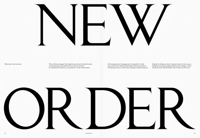
An editorial magazine layout featuring "NEW ORDER" in large serif type across two facing pages with body text columns and thematic photography.
Summary
A high-contrast editorial spread using oversized serif letterforms as the dominant visual element, with supporting columns of justified body text below.
Visual description
Two magazine pages shown side-by-side. The left page opens with "NEW" in large serif capitals, continuing onto the right page as "ORDER". Black text columns of varying widths flow below the headline, arranged in a modern four-column grid. The layout uses stark black and white contrast with generous negative space. A date marker "October 2021" appears at the bottom of the spread.
Key takeaway
Typographic scale as the primary design move—letting the headline letterforms do structural work while body text remains secondary. The asymmetric column arrangement adds sophisticated complexity to an otherwise minimal palette.
Reuse notes
Ideal for editorial design, cultural magazines, or annual reports requiring gravitas. Works well for narrative content or feature storytelling. The high contrast and large type demand careful typographic pairing; works best with classical serif faces.
More like this
Keep what you find
A free account saves references to boards and can send you a weekly email of picks based on what you save.
To see every result, go Pro.