Preview image. Unlock full-res
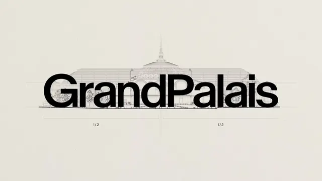
A brand identity slide showing the bold wordmark "GrandPalais" overlaid on a fine-line architectural elevation drawing of the building it names.
Summary
The wordmark "GrandPalais" is set in large bold black type directly over a delicate technical line drawing of the Grand Palais building's glass dome and facade, on a warm off-white background.
Visual description
A wide horizontal composition on a cream-toned ground shows a fine, single-weight architectural elevation drawing of the Grand Palais, including its ribbed glass dome, spire, colonnade, and surrounding trees, all rendered as thin black outline strokes typical of a technical blueprint. Overlaid across the middle of the drawing, spanning its full width, sits the wordmark "GrandPalais" in a heavy, tightly kerned sans-serif with the two words fused together and distinguished only by weight of the strokes. Faint dotted guideline rules run above and below the wordmark, and small "1/2" fraction labels sit centered beneath each half of the composition, suggesting this is one panel of a two-part measurement or specimen layout.
Key takeaway
Layering a bold, present-day wordmark directly on top of a fine historical architectural line drawing lets the logotype borrow scale and gravitas from the building itself without needing a literal illustration of it.
Reuse notes
Good reference for cultural institution or heritage-site branding, exhibition identity systems, or any wordmark presentation that wants to visually anchor a name to a specific piece of architecture. The dotted measurement guides and "1/2" labels suggest this is a construction or grid-specification slide from a larger brand guideline deck rather than a finished poster.
More like this


Keep what you find
A free account saves references to boards and can send you a weekly email of picks based on what you save.
To see every result, go Pro.