Preview image. Unlock full-res
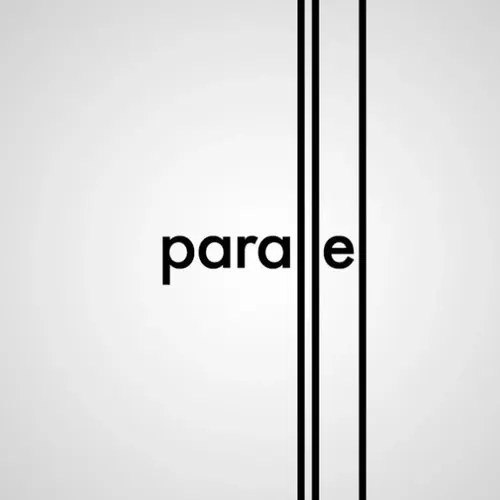
Minimal geometric composition with the word "parallel" in bold sans-serif and two thick black vertical lines on a light gray background.
Summary
A centered typographic composition with the word "parallel" in bold sans-serif type, flanked by two thick black vertical lines that divide the light background into zones.
Visual description
Square or near-square light gray background. Two thick black vertical lines dominate the composition, creating three equal or near-equal zones. The word "parallel" sits centered in bold, black sans-serif type, its letters fitting snugly between the two lines. The type weight and line thickness are carefully balanced; the letterforms mirror the structural clarity of the vertical strokes. Abundant white space surrounds all elements. The composition reads as both a typographic study and a geometric abstraction.
Key takeaway
Typography as line and form. The word itself ("parallel") echoes the visual relationship between type and structural lines, creating conceptual coherence between content and form. Restraint and balance achieve visual impact without color or ornament.
Reuse notes
Strong reference for minimalist branding, architectural signage, or editorial typography. Works well at any scale, from small print to large-format installation. The self-referential concept (word = form) is memorable and suitable for design-forward or tech-focused brands. Suitable for both digital and print applications.
More like this



Keep what you find
A free account saves references to boards and can send you a weekly email of picks based on what you save.
To see every result, go Pro.