Preview image. Unlock full-res
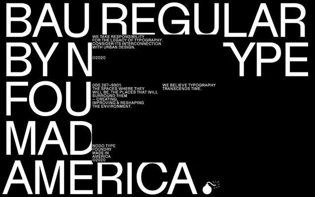
A typography specimen sheet for Bau Regular typeface with a bold, all-caps headline and manifesto copy on black background, celebrating the typeface's role in urban design.
Summary
A typography specimen sheet for Bau Regular typeface with a bold, all-caps headline and manifesto copy on black background, celebrating the typeface's role in urban design.
Visual description
A black background with white text arranged in a manifesto-style layout. Large all-caps sans-serif heading reads 'BAU REGULAR BY NODO TYPE FOUNDRY MADE IN AMERICA' split across lines. Below are smaller lines of body copy including mission statement text and contact information (000-267-9901). Additional text mentions dates and references (Blade Runner, E.T., Tron). A small icon mark appears in the lower right. The composition is grid-based and technical.
Key takeaway
Turning a typeface specimen into a brand statement through strategic use of hierarchy and manifesto language. The all-caps letterforms become both specimen and message.
Reuse notes
Reference for type foundry branding, design-focused marketing, and how to present typography as a designed system rather than just a font. The manifesto approach conveys design philosophy beyond mere technical specs.
More like this

Keep what you find
A free account saves references to boards and can send you a weekly email of picks based on what you save.
To see every result, go Pro.