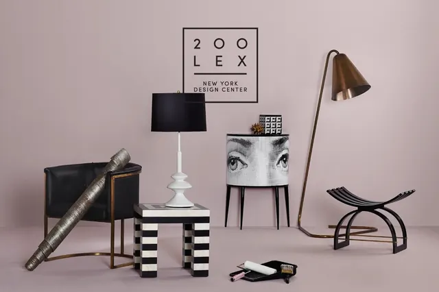
Preview image. Unlock full-res
Minimalist branding composition featuring wordmark typography on neutral background, Swiss modernism aesthetic, grayscale palette.
Summary
Restrained branding layout with a wordmark as the focal point, set against a neutral warm-gray background in a Swiss modernist arrangement.
Visual description
Warm beige-gray background (#B5A5A6 dominant). Clean sans-serif wordmark "RoAndCo" in dark charcoal (#262121) positioned with generous whitespace. Minimal typography hierarchy. No imagery, no decoration. Centered or grid-aligned layout. Pure type-driven design. Professional, restrained color palette.
Key takeaway
A strong wordmark in the right gray is its own brand statement. Whitespace is a design material. Restraint in palette makes type weigh more.
Reuse notes
Works for luxury brands, agencies, studios, law firms, any B2B or prestige sector. Requires a distinctive wordmark. Warm gray feels more human than cold gray. Can feel dull if the wordmark is weak.
More like this




Keep what you find
A free account saves references to boards and can send you a weekly email of picks based on what you save.
To see every result, go Pro.