
Preview image. Unlock full-res
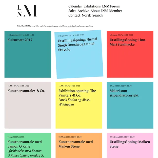
Multi-tonal composition balancing teal (#2D8F9C), light cream (#EDEBE6), and warm accents creating sophisticated color harmony.
Summary
Sophisticated palette balancing cool teal (#2D8F9C) with warm golden accent (#F2A20C) and light cream background (#EDEBE6), demonstrating complementary color harmony.
Visual description
Professional composition using complementary color theory. Cool teal-blue (#2D8F9C) dominates creating calm, contemporary feel while warm golden-orange accent (#F2A20C) provides visual pop and interest. Light cream (#EDEBE6) background maintains sophistication and allows both colors to shine. The balance creates dynamic yet harmonious composition without clashing.
Key takeaway
Complementary color harmony creates visual interest and balance. Cool teal paired with warm orange demonstrates effective contrast while light background prevents visual overwhelm. Shows how warm accents brighten cool palettes without disrupting calm.
Reuse notes
Excellent model for modern design, web design, and contemporary branding. Strong for tech companies, creative agencies, or modern lifestyle brands. Use as foundation for color harmony exercises. The balance of cool and warm appeals to professional and creative audiences. Works across print, digital, and environmental design contexts.
More like this







Keep what you find
A free account saves references to boards and can send you a weekly email of picks based on what you save.
To see every result, go Pro.