Preview image. Unlock full-res
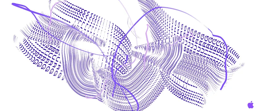
A horizontal digital interface design featuring soft purple gradients and light cream background creating a calm, accessible digital aesthetic.
Summary
A refined digital interface combining soft purple gradients with a light cream foundation, establishing a calming yet sophisticated aesthetic suitable for modern web and app design.
Visual description
The design features a predominantly light cream (#F4F2F7) background providing warmth and softness. Soft purple gradients (#6C4EC7 to #AD9CD9) add visual interest and hierarchy without creating jarring contrast. Light, readable typography in sans-serif maintains the gentle aesthetic. The overall composition feels airy and approachable, prioritizing legibility and user comfort.
Key takeaway
Soft gradients used carefully can create visual interest while maintaining accessibility and a calm user experience. This approach demonstrates how to bring vibrancy to minimal design without sacrificing legibility or serenity.
Reuse notes
Ideal for SaaS applications, wellness platforms, or creative tool interfaces. The soft color palette creates approachability while the gradient adds contemporary polish. Works particularly well for applications aimed at reducing stress or creating peaceful experiences.
More like this



Keep what you find
A free account saves references to boards and can send you a weekly email of picks based on what you save.
To see every result, go Pro.