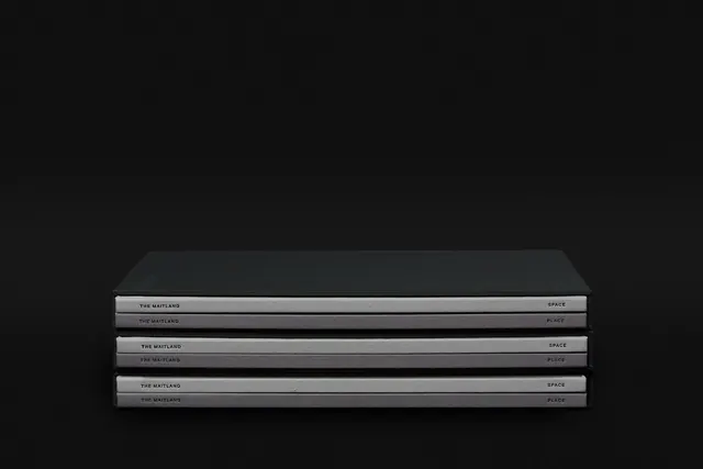
Preview image. Unlock full-res
A design system showcase featuring monochromatic typography and layout exploration with high-contrast grayscale treatment, exemplifying editorial branding discipline.
Summary
A design system exploration for The Maitland branding project by Studio Brave, showcasing monochromatic layout compositions with refined typography and architectural photography integration.
Visual description
The image displays a carefully structured layout featuring black (#121212) and gray (#8F8F8F, #545154) elements arranged with clear hierarchy. Sans-serif typography is prominent, likely serving as system documentation. A photograph of architectural/landscape elements is integrated seamlessly into the layout. The overall composition emphasizes structural clarity and refined editorial pacing.
Key takeaway
The power of constraint: limiting to monochromatic treatment and sans-serif type creates a cohesive, sophisticated system. The integration of photography into structured grid demonstrates thoughtful layout discipline. This is restraint as a design strength.
Reuse notes
Excellent reference for corporate branding systems and design documentation layouts. Use when designing brand guidelines or high-end property/development marketing. The monochromatic approach reads as premium and professional. The layout strategy pairs well with architectural or luxury goods imagery. Strong template for branded collateral.
More like this




Keep what you find
A free account saves references to boards and can send you a weekly email of picks based on what you save.
To see every result, go Pro.