Preview image. Unlock full-res
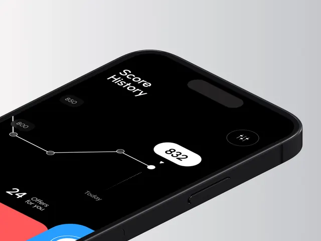
A dark-mode interface design for a financial or fintech application, featuring a balanced grayscale palette with light gray primary background and deep black elements for contrast.
Summary
A dark-mode financial application interface featuring a sophisticated grayscale palette with light gray backgrounds and deep black accents, designed for a fintech insights platform emphasizing clarity and trust.
Visual description
The design utilizes a high-contrast grayscale palette: light silver-gray (56.3%) as the dominant background providing reduced eye strain in dark environments, with pure black or near-black (42.4%) for critical UI elements, text, and visual hierarchy. The proportion distribution suggests a functional financial interface with clear information hierarchy.
Key takeaway
The balanced dark-mode palette with light gray backgrounds demonstrates how to achieve visual comfort while maintaining professional trust essential for financial applications. The minimal color palette removes distraction, allowing users to focus on data and decisions.
Reuse notes
Essential reference for fintech, financial, or data-heavy applications requiring dark-mode support. The grayscale approach works across all user demographics and accessibility requirements. Excellent for reducing eye strain during extended use typical of financial monitoring. Suitable for enterprise, banking, or investment platform interfaces.
More like this




Keep what you find
A free account saves references to boards and can send you a weekly email of picks based on what you save.
To see every result, go Pro.