
Preview image. Unlock full-res
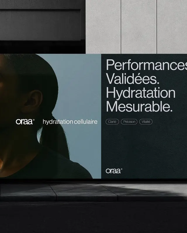
A user interface composition in soft blues and warm earth tones, demonstrating a cohesive color system with sophisticated tonal layering.
Summary
A user interface composition in soft blues and warm earth tones, demonstrating a cohesive color system with sophisticated tonal layering.
Visual description
The composition uses a muted, cool, earthy palette, creating a calm visual impression. The design demonstrates minimal principles with sans-serif typography treatment. The color scheme centers on dominant tones that establish visual hierarchy and emotional resonance.
Key takeaway
The strategic use of color harmony and tonal variation to create a sophisticated, cohesive design. The minimal approach demonstrates discipline in visual restraint and effective use of negative space.
Reuse notes
This design works well for projects requiring calm, professional presentation. The color palette pairs effectively with minimal aesthetics. Consider the muted, cool, earthy color strategy when designing similar branded or editorial compositions.
More like this






Keep what you find
A free account saves references to boards and can send you a weekly email of picks based on what you save.
To see every result, go Pro.