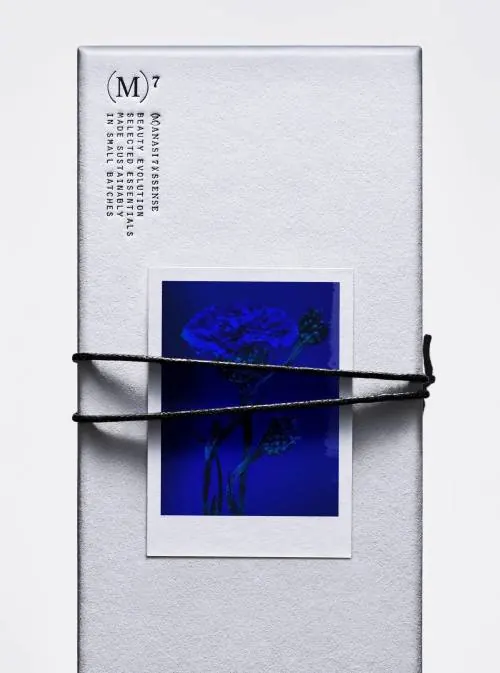
Preview image. Unlock full-res
Minimal composition balancing deep navy and crisp white, emphasizing geometric contrast and spatial relationships.
Summary
A stark, minimal composition using only deep navy blue and crisp off-white tones to create geometric form and spatial contrast.
Visual description
The image presents a binary color system: nearly pure white or very light gray paired with deep navy or nearly black blue. The composition appears to emphasize geometric forms—possibly abstract shapes, lines, or spatial arrangements—where the color contrast itself defines the structure. The minimal use of only two tones creates a clean, almost diagrammatic quality. The arrangement suggests intentional geometric organization rather than organic form.
Key takeaway
The extreme simplicity of a two-tone palette can create powerful visual statements through contrast and geometric organization. This approach emphasizes clarity and structure over decoration.
Reuse notes
Perfect for technical, architectural, or minimal luxury brands emphasizing precision and clarity. Works well for scientific or technical communication, product design, or contemporary art direction. The stark contrast ensures excellent legibility and makes it suitable for contexts where simplicity and sophistication must be communicated simultaneously. Particularly effective in motion graphics or as accent elements in larger designs.
More like this







Keep what you find
A free account saves references to boards and can send you a weekly email of picks based on what you save.
To see every result, go Pro.