
Preview image. Unlock full-res
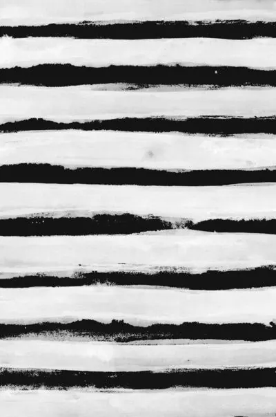
Minimalist abstract composition with nearly balanced distribution between light gray and near-black, creating stark high-contrast division.
Summary
A nearly perfectly balanced abstract composition featuring light gray and near-black in almost equal proportions, creating a striking high-contrast visual statement.
Visual description
The composition is divided between light gray (#E6E6E6 at 56.1%) and near-black (#1A1A1A at 43.6%), with the slight favor toward the lighter tone creating visual breathing room. The tall portrait format (925x1246) emphasizes the vertical division and geometric simplicity of the two-color palette.
Key takeaway
The near-equal balance between light and dark demonstrates how sophisticated composition can emerge from the simplest possible color choices. The contrast level is extreme but not fatiguing due to the balanced spatial distribution.
Reuse notes
Perfect for minimalist design systems, abstract art, or as a foundation for typography-heavy layouts. The balanced color split works well for dividing content or creating visual sections without additional design elements. Ideal for portfolio sites, design studios, or contemporary art applications. Consider using as background for high-impact typography or as a basis for minimal branding systems.
More like this



Keep what you find
A free account saves references to boards and can send you a weekly email of picks based on what you save.
To see every result, go Pro.