Preview image. Unlock full-res
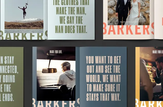
Portfolio showcase of brand identity collateral for Barkers clothing, laid out as overlapping printed materials in muted greens and earth tones.
Summary
A portfolio layout showcasing the Barkers brand identity system with layered printed materials, including photography and typographic studies in a muted earth-tone palette.
Visual description
Multiple overlapping rectangular cards and poster mockups arranged in a flat lay. A large oversized serif or slab-serif "BARKERS" wordmark dominates the composition in warm tan and coral tones. Surrounding elements include smaller supporting cards with typography, lifestyle photography of people in outdoor and vehicle settings, and text-heavy layouts. A palette of soft greens, warm grays, and muted browns creates cohesion across all pieces. The arrangement emphasizes hierarchy through layering and size variation.
Key takeaway
Showing the full brand ecosystem at once through a sophisticated collage of real printed pieces and photographs. The muted palette and generous white space communicate premium positioning, while the layered composition demonstrates design system depth and versatility.
Reuse notes
Effective for portfolios, case studies, and brand guideline presentations. The overlapping card approach works well when you want to show multiple applications in one frame without overwhelming the viewer. Reuse the palette for editorial or luxury brand contexts. Works best at large sizes where type and imagery remain legible.
More like this







Keep what you find
A free account saves references to boards and can send you a weekly email of picks based on what you save.
To see every result, go Pro.